UPG · UX audit & research
Turning a fragmented fuel-station experience into a clearer digital ecosystem.
UPG had strong foundations — a growing station network, a loyalty program, mobile fuel payment, café services and a recognisable price proposition. Customers just didn't always understand those advantages, trust the quality story, or move smoothly between the website, the app, support and the station itself. I ran a cross-channel UX audit and deep research to find where clarity and trust were lost, benchmark UPG against market leaders, and turn the findings into a practical improvement roadmap.
Client
UPG — Ukrainian fuel-station network
Project type
UX audit & digital experience strategy
Role
Product / UX Designer
Collaboration
Agency project with FEDORIV
Scope
Website · Mobile app · Loyalty · Support · On-site touchpoints
Methods
Desk research · Feedback analysis · UX & content audit · Benchmarking · Segmentation
Benchmark set
WOG PRIDE · Fishka / OKKO · category examples
Outcome
Structured gap map + prioritised recommendations
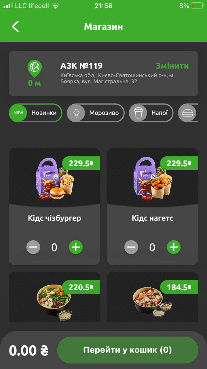
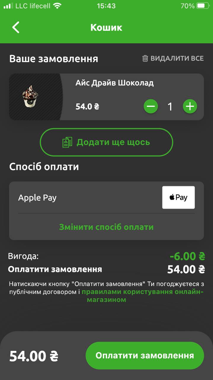
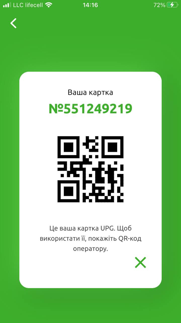
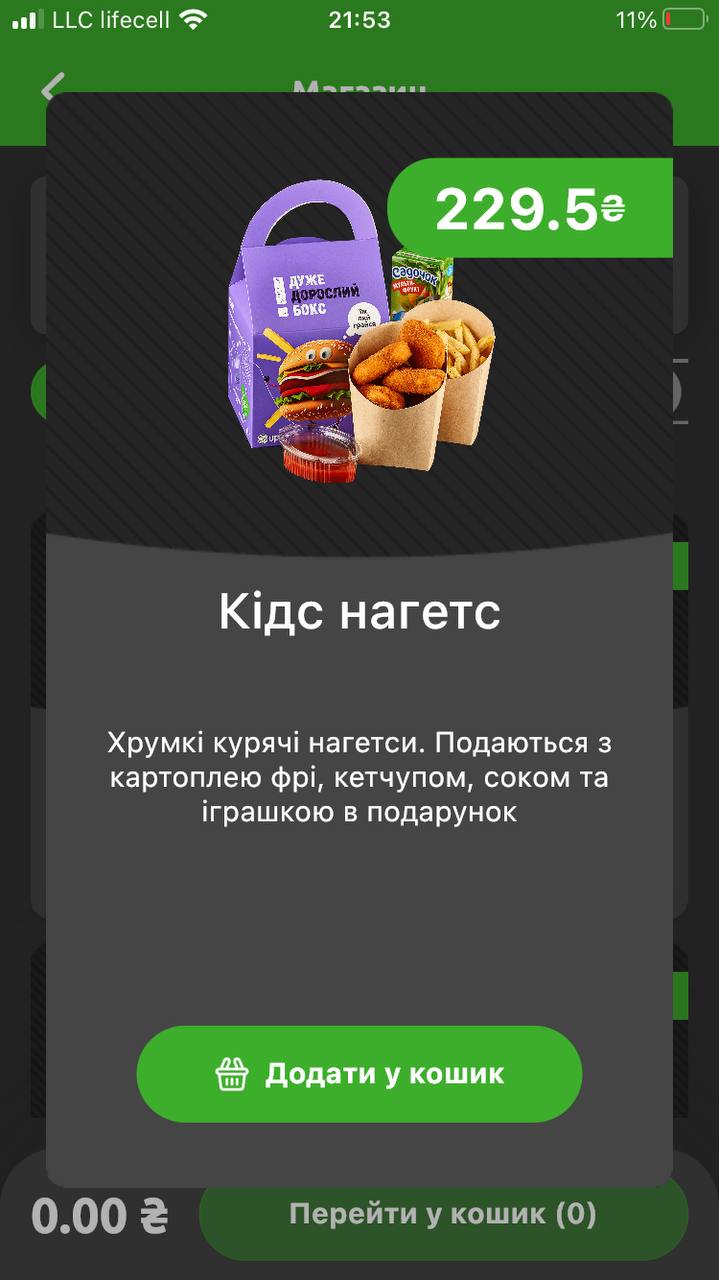
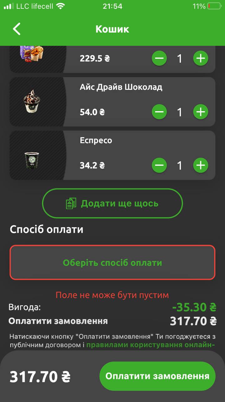
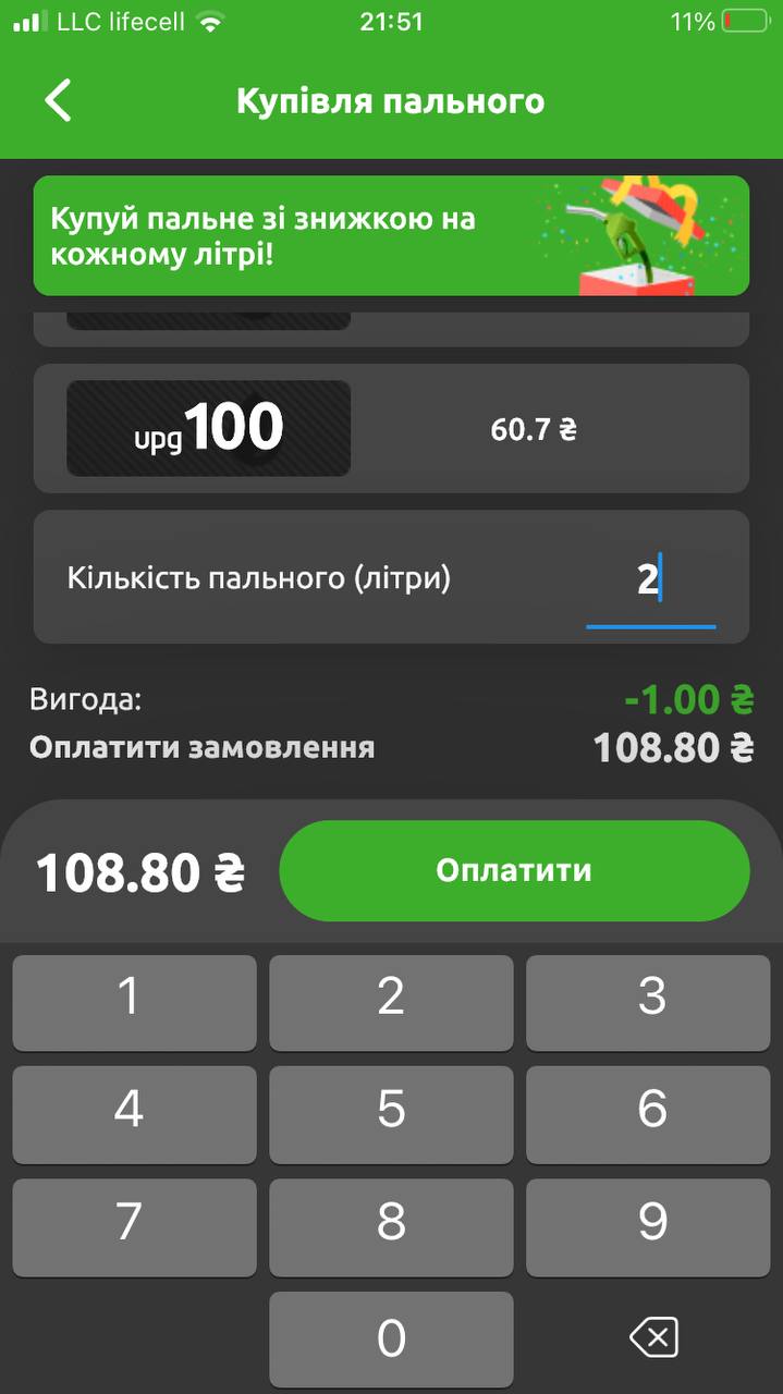
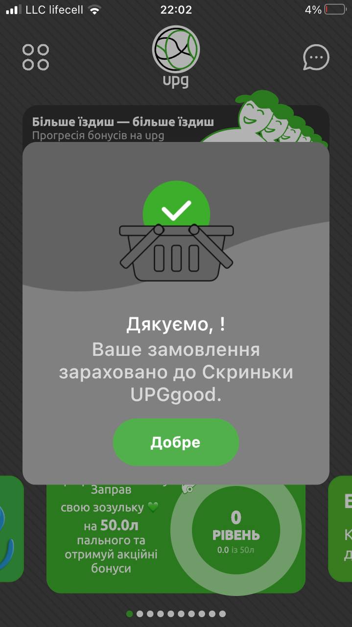
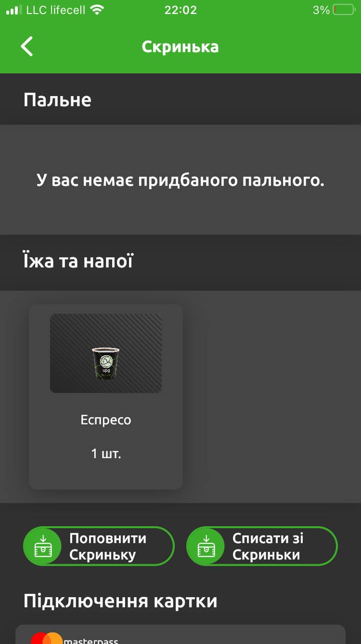
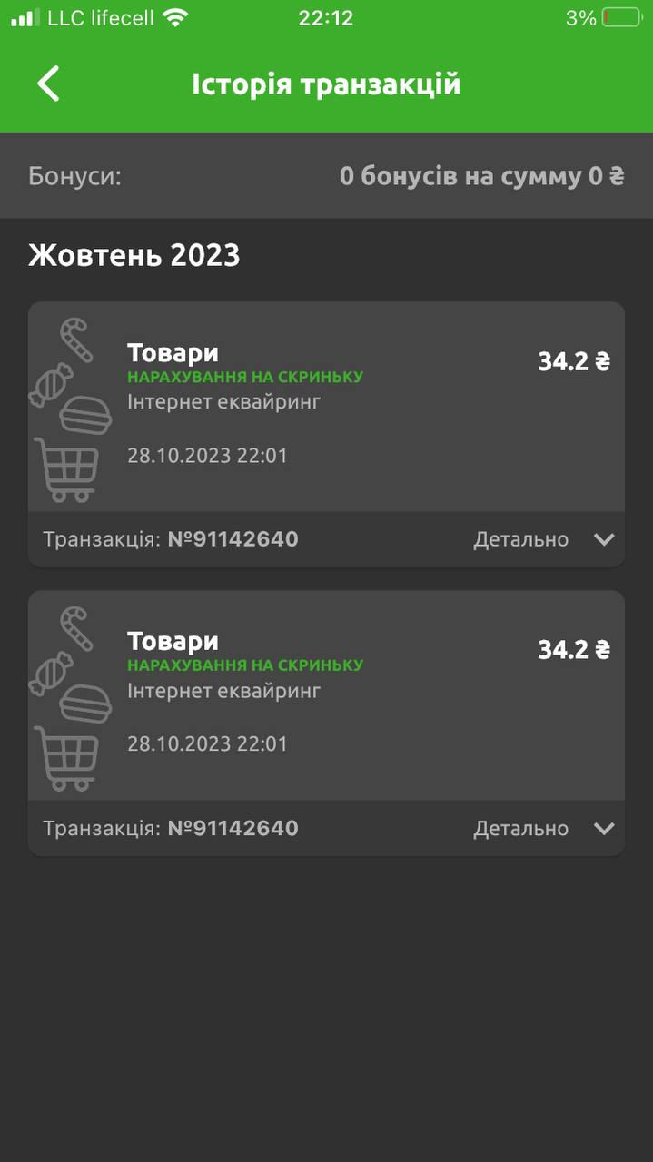
Current UPG app screens before the audit
01 — The challenge
Choosing a fuel station is never only a price decision.
Drivers balance rational and emotional factors: fuel quality, trust, location, speed, loyalty benefits, food, cleanliness and service. UPG had most of those capabilities — but the experience never communicated them as one coherent value proposition. Information was scattered, key actions were hard to discover, and customer concerns weren't consistently answered across channels.
Audit question 01
What makes drivers choose and stay loyal to a fuel-station brand?
Audit question 02
Where do the website, app and service experience create friction or uncertainty?
Audit question 03
Which improvements strengthen trust, speed up everyday tasks and support loyalty growth?
02 — The app today
The current UPG experience — where the audit started.
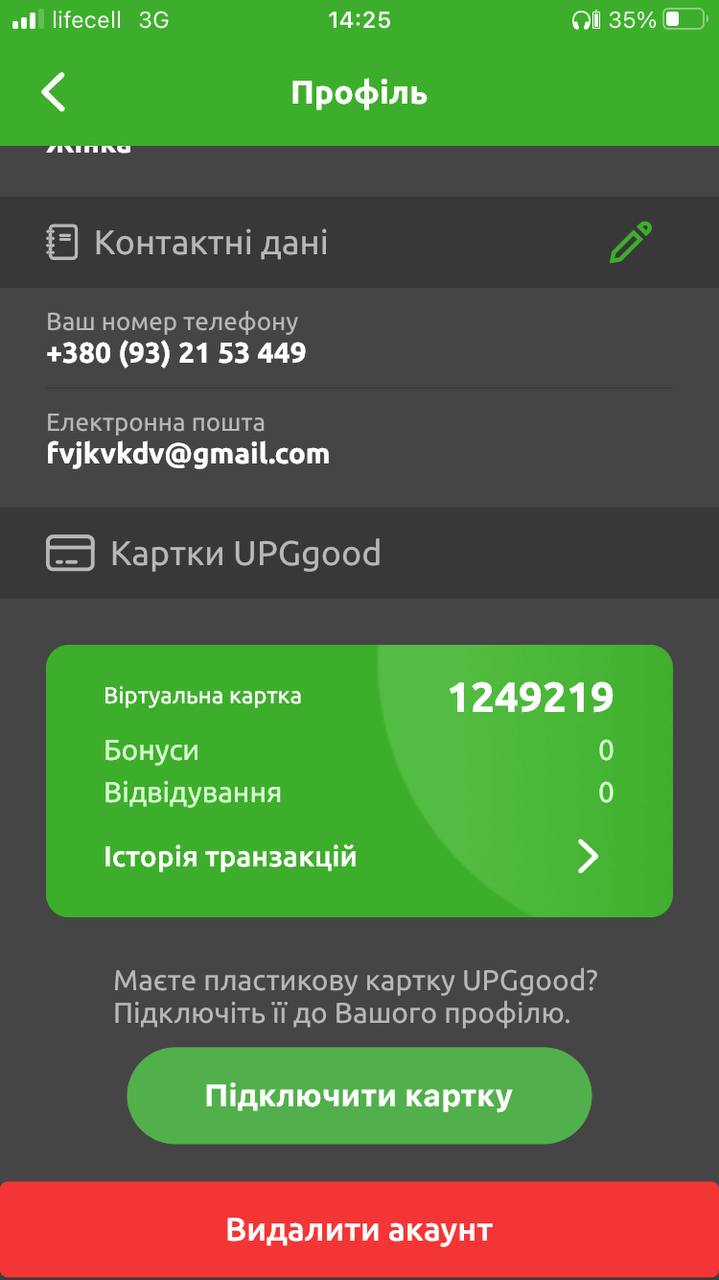
These are real screenshots of the UPG app before the redesign. They show the existing flows the audit covered: profile and loyalty card, in-store ordering, fuel purchase, payment, order confirmation, the digital UPG card, and transaction history.
03 — My role
I audited the whole service journey, not isolated interfaces.
Research, synthesis and product strategy: analysing needs and public feedback, mapping audience segments and decision criteria, auditing the website's architecture, content and key journeys, benchmarking the app and loyalty proposition, and converting fragmented observations into product opportunities.
04 — Research approach
Four lenses: choice drivers, competitors, content, and real customer voices.
What actually drives choice and loyalty
Trust
Confidence in fuel quality and in the company behind it.
Convenience
Location, queues, payment options, speed of service.
Value
Fuel price, rewards and the practical usefulness of bonuses.
Service
Food, coffee, cleanliness, staff and facilities.
Four behavioural segments as an evaluation lens
Shares below come from the referenced category research, not from primary UPG studies. They were used to check whether the experience served different priorities instead of one universal driver.
| Segment | Share | Primary motivation |
|---|---|---|
| Rationalists | 32% | Price and measurable value |
| Brand-oriented | 29% | Familiarity, consistency, trust |
| Service-oriented | 23% | Food, comfort, cleanliness, staff |
| Time-sensitive | 17% | Speed and absence of queues |
Competitive benchmarking
UPG compared with WOG PRIDE and Fishka / OKKO to separate category expectations from real differentiation opportunities.
- Onboarding and account access
- Station search and service filters
- Fuel and café purchases
- Payment at the pump
- Loyalty mechanics and partner benefits
- Transaction history and spend visibility
- Personal offers, support and feedback
- Information available without registration
Website & content audit
I read the site as a driver trying to answer practical questions:
- Why should I trust UPG fuel?
- Which station has the service I need?
- What is the price at that specific station?
- How does UPG Pay work?
- What can I do in the app?
- Where do I report a problem?
Public feedback was then grouped into recurring themes rather than isolated complaints — which exposed the links between digital gaps and operational pain points like queues, staff communication, cleanliness and confidence in fuel quantity.
05 — Key findings
Seven gaps — each with the opportunity it opens.
Finding 01
Fuel quality was the central trust question — and the content didn't answer it
Drivers judge quality indirectly: engine behaviour, consumption, mileage, word of mouth. UPG published certificates, but customers had to open technical documents and interpret figures themselves.
Opportunity: A fuel-quality hub: plain-language explanations, origin and testing, key specs, independent verification, downloadable certificates.
Finding 02
The station finder didn't support real journey planning
A pin on a map wasn't enough. People needed opening status, available services, the exact local price and warnings about shift changes. The region selector also showed loading issues during the audit.
Opportunity: Task-oriented discovery: filters by service and hours, station-level prices, route-relevant details, temporary availability states.
Finding 03
Valuable digital services were under-explained
The website barely presented the mobile app and never explained UPG Pay, so less digitally confident customers had no reason to install or trust contactless fuelling.
Opportunity: A dedicated app page: benefits plus step-by-step guidance for buying fuel online, paying at the pump, spending bonuses, café orders and personal offers.
Finding 04
Loyalty worked as a transaction, not as a relationship
Progressive fuel rewards gave a clear mechanism, but competitors extended loyalty through partner networks, personal offers, charity, analytics and reward catalogues — many more reasons to return.
Opportunity: Evolve loyalty around segments and behaviour: relevant offers, understandable progress, partner value, meaningful redemption.
Finding 05
Support and feedback loops were fragmented
Contacts were hard to scan by need, there was no structured way to submit a question or complaint, and public replies to negative reviews sometimes weakened trust instead of showing ownership.
Opportunity: Segmented contacts, a structured request form, incident classification by station and issue, defined ownership and response standards.
Finding 06
The architecture mixed different audiences and intents
Driver, business and corporate content shared one navigation. Customer-facing pages competed with company storytelling, and several useful services never read as one offering.
Opportunity: Three clusters: For drivers · For business · About UPG.
Finding 07
Some friction couldn't be solved by interface design at all
Feedback repeatedly tied long waits to one queue serving both fuel payments and café orders — an interface, staffing and process problem at once.
Opportunity: Self-service and mobile-payment adoption, queue separation, independent café ordering, operational monitoring at peak hours.
The most important audit conclusion: even the best digital experience stays limited if the underlying service process doesn't change.
06 — Prioritised roadmap
Recommendations ordered by customer value and delivery effort.
Priority 1
Restore clarity and trust
- Explain fuel quality in customer language
- Fix critical station-finder issues
- Show station-level services, hours and prices
- Create clear support and complaint flows
- Improve tone and ownership in public responses
Priority 2
Make high-frequency journeys easier
- Explain and promote UPG Pay
- Simplify access to payment, bonuses and history
- Improve station and service filtering
- Tie app adoption to visible everyday benefits
- Reduce dependency on the physical checkout
Priority 3
Build a stronger loyalty ecosystem
- Personalise offers by behaviour and segment
- Extend partner rewards and useful benefits
- Make bonus rules and progress understandable
- Add meaningful redemption options
- Put feedback and research loops inside the product
Priority 4
Develop the broader brand experience
- Communicate social and environmental initiatives credibly
- Highlight successful café products and services
- Connect digital content with real station experiences
- Create reasons to engage beyond refuelling
07 — Product direction
One principle, six experience pillars.
Help drivers make a confident choice, complete routine tasks quickly, and always understand the value they get from UPG.
01
Trust
Transparent fuel-quality information and accountable support.
02
Find
Reliable station discovery based on real driver needs.
03
Pay
Clear, fast and well-explained self-service payment.
04
Reward
Visible, relevant and understandable loyalty value.
05
Serve
Connected digital and on-site service processes.
06
Learn
Continuous feedback, incident tracking and segmentation.
08 — Deliverables & outcome
A shared evidence base for talking about experience, not just visuals.
Deliverables
- Customer-choice and behavioural-segment synthesis
- Competitive feature benchmark: UPG · WOG PRIDE · Fishka / OKKO
- Website UX and content audit
- Mobile app and loyalty ecosystem comparison
- Customer-feedback themes and service pain points
- Opportunity areas and prioritised recommendations
- Strategic direction connecting website, app, loyalty and station service
Outcome
The audit showed where customer trust, operational service and digital usability influence one another, and turned a large volume of market information and feedback into a structured improvement roadmap.
Implementation and post-launch metrics were outside the available project evidence, so this is presented as an audit and strategy outcome — no claimed conversion or retention numbers.
09 — What this project shows