Raiffeisen Bank Ukraine · MyRaif · P2P transfers
From 24 seconds to 4–5 seconds through two product iterations.
I redesigned Raiffeisen’s P2P transfer experience from the ground up and refined it through two measurable iterations, balancing speed, customer confidence and mandatory banking requirements.
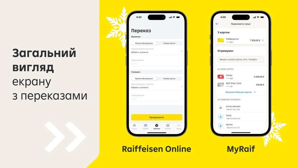
Project snapshot
Company
Raiffeisen Bank Ukraine
Product
MyRaif mobile banking app
Role
Senior Product Designer
Scope
Research, flow architecture, co-design, prototyping, UI/UX design and usability testing
Collaboration
Product manager, analysts, engineers, business and security/compliance stakeholders
Constraint
Simplify the journey inside the existing design system and mandatory banking requirements
Measured result
24 sec → 8–9 sec in Iteration 1 → 4–5 sec in Iteration 2
Broader mobile product context
Scale of the product the P2P work was part of.
The P2P work was part of building Raiffeisen’s new mobile banking experience. The new app reached 400K monthly active users, while the broader mobile product organisation reported 82% retention and 92% CSAT. These figures describe the scale and performance of the broader product, not the isolated impact of the P2P redesign — the transfer-specific success metric was time on task.
400K
Monthly active users
82%
Retention
92%
CSAT
The product team delivered an interconnected set of financial capabilities, including P2P transfers, Visa Alias, e-signing and app navigation. Delivery required coordination across design, development, support, operations, IT security, compliance and anti-fraud functions.
01 — The challenge
Three times slower than the leading local benchmark.
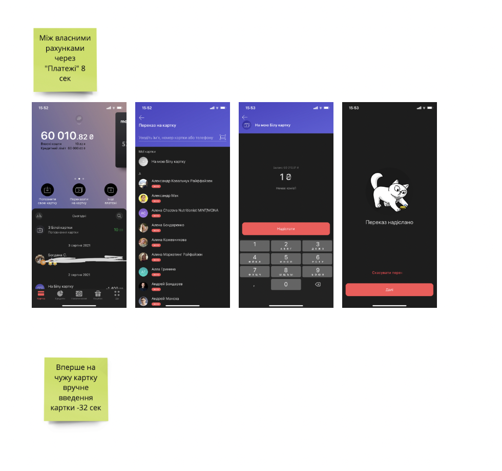
The existing P2P journey took customers an average of 24 seconds to complete. Monobank, the strongest local benchmark, enabled the same core task in approximately 8 seconds.
This was not merely a visual-design problem. The flow contained additional decisions, confirmations and navigation steps, while some of the most common transfer scenarios were not easy to find. At the same time, we could not remove controls without considering banking security, transaction accuracy and regulatory requirements.
How might we make a transfer feel nearly instant while preserving the confidence and control expected from a bank?
Success criteria
- Reduce the time required to complete a transfer.
- Improve discoverability of frequent recipient scenarios.
- Remove unnecessary cognitive load and duplication.
- Maintain clear confirmation of the amount, sender and recipient.
- Work within the existing Raiffeisen design system.
- Preserve mandatory security and compliance requirements.
24 sec
Original Raiffeisen
8 sec
Monobank benchmark
8–9 sec
Iteration 1
4–5 sec
Iteration 2
02 — My role
From problem investigation to validated interaction design.
- Benchmarking competitor flows and measuring time on task.
- Interviewing customers about transfer habits and points of confusion.
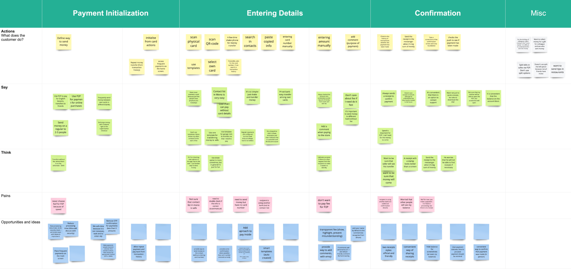
- Mapping the end-to-end journey and identifying high-friction moments.
- Defining the architecture of reusable transfer components.
- Facilitating co-design sessions with the product team and stakeholders.
- Creating and iterating prototypes.
- Designing the final experience within the existing design system.
- Conducting usability tests and incorporating feedback.
I also worked with product, analytics, engineering and banking stakeholders to distinguish genuinely mandatory steps from legacy interaction patterns that could be simplified.
03 — Research process
Benchmark · Interview · Map · Test
1. Establishing a behavioural benchmark
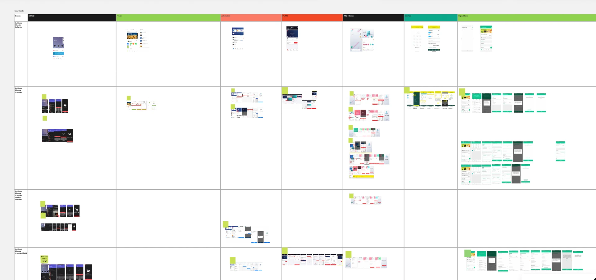
We compared P2P journeys across the Ukrainian banking market. Instead of creating a feature checklist, I measured the complete task: entering the transfer journey, choosing the source of funds, identifying the recipient, entering the amount, reviewing the transaction and confirming completion.
For each competitor I looked at
- Total time on task and number of screens and decisions.
- Amount of information requested from the customer.
- Location of the most frequent transfer options.
- Use of contacts, recent recipients and templates.
- Handling of errors and insufficient data.
- The moment at which confirmation was requested.
The benchmark exposed a significant gap: 24 seconds in the current Raiffeisen flow versus approximately 8 seconds for Monobank. This gave the team a measurable problem and prevented the redesign from becoming a subjective discussion about visual preferences.
2. Understanding real transfer behaviour
Customer interviews and product feedback showed that “P2P transfer” was not one homogeneous use case. People frequently needed to:
- Move money between their own Raiffeisen cards or accounts.
- Repeat a recent transfer.
- Send money to a person already saved in their contacts.
- Reuse a recipient or payment template.
- Enter a new card number only when no familiar shortcut existed.
The old experience gave too much structural weight to manual input and did not make repeat behaviour sufficiently visible. A frequent banking action was being treated like a new transaction every time.
3. Mapping the journey and locating friction
I mapped the existing customer journey to separate functional steps from emotional and cognitive friction.
- Unclear entry points for transfers between a customer’s own products.
- Repeated selection or re-entry of information already known to the bank.
- Recipient shortcuts appearing too late or lacking clear hierarchy.
- Multiple confirmations adding time without always adding meaningful confidence.
- A long linear flow for scenarios that could be completed through a shortcut.
- Insufficient distinction between frequent and exceptional transfer behaviour.
01
Repeated input
02
Late recipient shortcut
03
Redundant confirmation
04 — Process · workshops and working artifacts
How the team got from a slow flow to a shared problem definition.
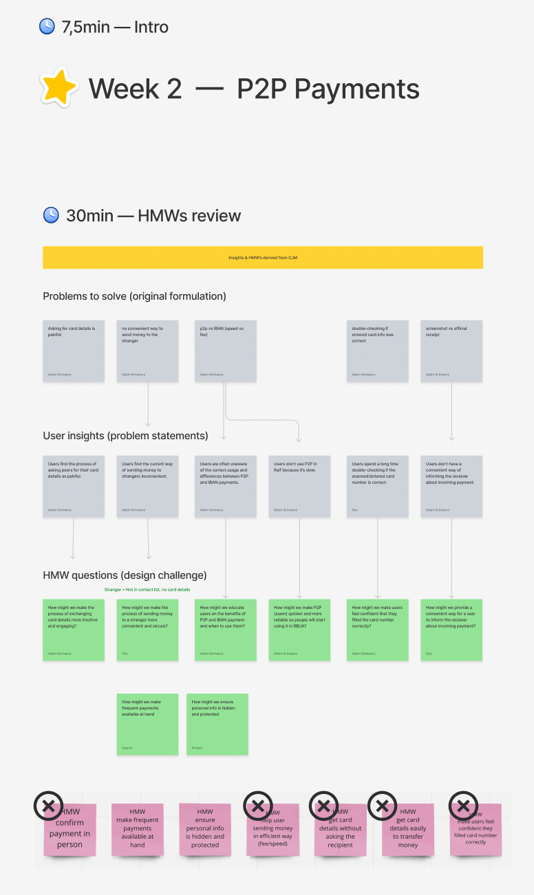
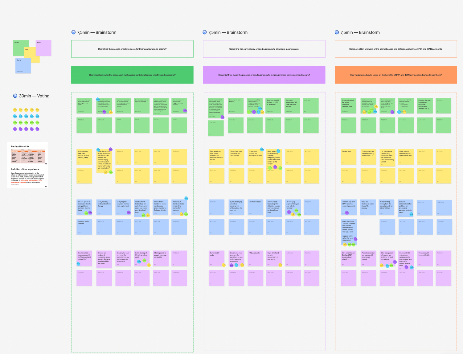
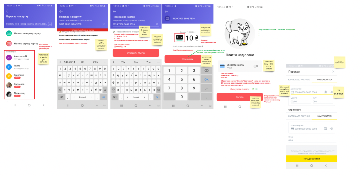
The redesign was not a solo UI exercise. Benchmarking, journey mapping and facilitated co-design workshops with product, analytics and banking stakeholders turned "the transfer feels slow" into specific, agreed problem statements and HMW questions before any screen was designed.
05 — Core insight
Most customers should not have to rebuild a transfer from zero. The interface should recognise intent from existing relationships and recent behaviour.
05 — Original flow
A long linear journey for a task people expected to be instant.
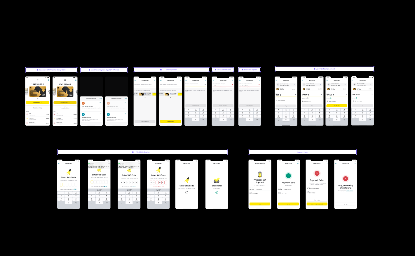
The original experience was long and primarily linear. It required users to move through more screens and decisions even when the bank already had enough context to shorten the task. The dark flow map below shows the full original state space I started from.
- Frequent and new-recipient scenarios followed a similar structure.
- Useful recipient shortcuts were not prominent enough.
- Information and decisions were distributed across too many stages.
- The extra confirmation layer increased time on task.
- Moving money between personal Raiffeisen products was harder to discover than expected.
24 sec average time on task
06 — Co-designing within banking constraints
Speed versus confidence.
Customers wanted fewer steps, while the bank needed accurate recipient selection, transparent fees and amounts, and a deliberate confirmation moment. During co-design sessions we separated the flow into three layers.
Must remain
- Source of funds.
- Recipient identity or card details.
- Transfer amount.
- Relevant fee and total information.
- Secure transaction confirmation.
Could be simplified
- Repeated explanations.
- Duplicated summaries.
- Navigation between source and recipient selection.
- Information that could be preselected from context.
- An extra confirmation page repeating visible data.
Could become contextual
- Own-account transfers.
- Recent recipients.
- Phone contacts.
- Saved templates.
- Manual entry of a new card.
This framing helped stakeholders discuss risk at the level of specific information and actions rather than defending every existing screen.
07 — Recipient-first transfer architecture
Use known context to shorten the journey before asking for new information.
My accounts and cards
Transfers between a customer’s own products
Recent recipients
Repeated behaviour, one tap away
Contacts
People already known to the customer
Templates
Saved scenarios
New card
Manual entry, only when genuinely required
Component architecture
- Source-product selector.
- Recipient search and recipient groups.
- Contact or card result.
- Amount entry with fee and total disclosure.
- Validation and error states.
- Final review and confirmation.
- Success state with a repeatable next action.
The flow was designed as a reusable set of states and components rather than a collection of one-off screens. This made future transfer scenarios easier to extend while remaining consistent with the bank’s design system, and it shortened common paths without hiding critical transaction details.
08 — Exploration · not implemented
Exploring faster interaction models.
We explored NFC as a possible way to make an in-person P2P transfer feel immediate. The concept demonstrated a future direction, but the bank was not technically ready to implement the technology at that stage. The exploration still helped distinguish the long-term vision from improvements that could be delivered on existing infrastructure.
A useful concept should influence the roadmap even when it cannot be shipped immediately.
09 — Prototyping and usability testing
What we tested.
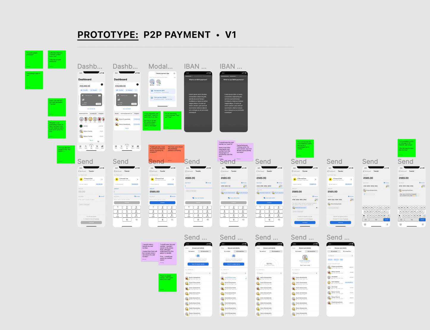
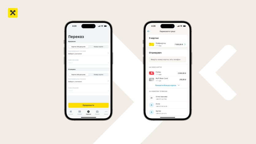
I built an interactive prototype to test the revised information architecture and the critical transfer paths. Findings informed several iterations of hierarchy, wording, recipient selection and confirmation behaviour.
- Understanding immediately where to transfer between their own cards.
- Finding a recipient through contacts or recent transfers.
- Understanding which card would be charged.
- Recognising the final amount and any fee.
- Correcting a mistake without restarting the flow.
- Completing the transfer without an extra explanatory screen.
10 — Iteration 1 · reaching the benchmark
From 24 seconds to 8–9 seconds.
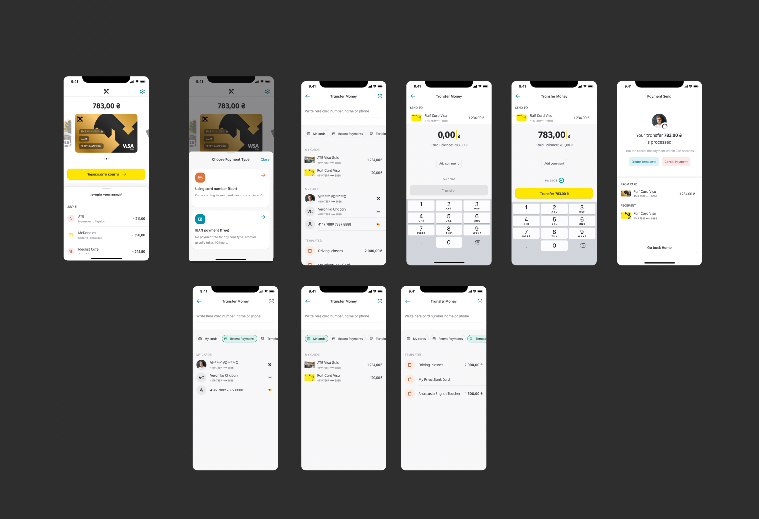
The first measurable redesign cut the average time on task from 24 seconds to roughly 8–9 seconds, matching the leading local benchmark. This iteration focused on removing redundant decisions, surfacing shortcuts earlier and grouping related information on fewer screens.
- Removed the separate payment-type choice when the context already implied it.
- Surfaced own cards, recent recipients and contacts as primary options.
- Combined source and recipient selection into a single coherent view.
- Kept mandatory amount, fee and confirmation details visible and editable.
- Preserved security and compliance requirements without extra explanation screens.
8–9 sec average time on task
11 — Final result · 4–5 seconds
Recognition over recall, frequent behaviour over manual entry.
- Own Raiffeisen accounts and cards became a clear transfer destination.
- Contacts, recent recipients and templates were surfaced earlier.
- Redundant screens and repeated information were removed.
- The additional confirmation page was eliminated where it did not add value.
- The amount, source and recipient remained visible at the decision point.
- The interaction reused existing design-system patterns.
- The structure supported both quick repeat transfers and new-card scenarios.
4–5 sec average time on task
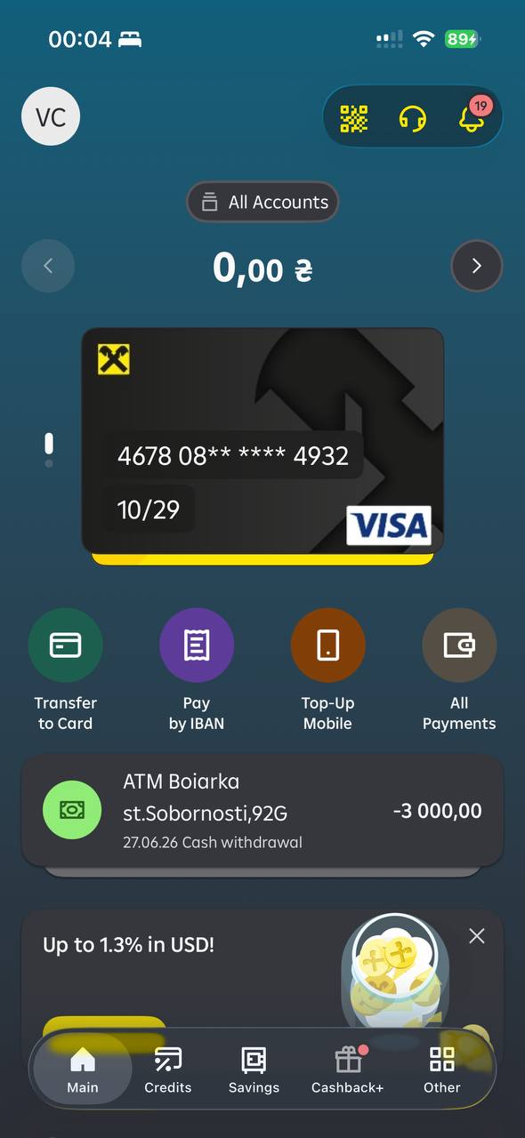
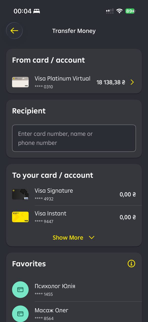
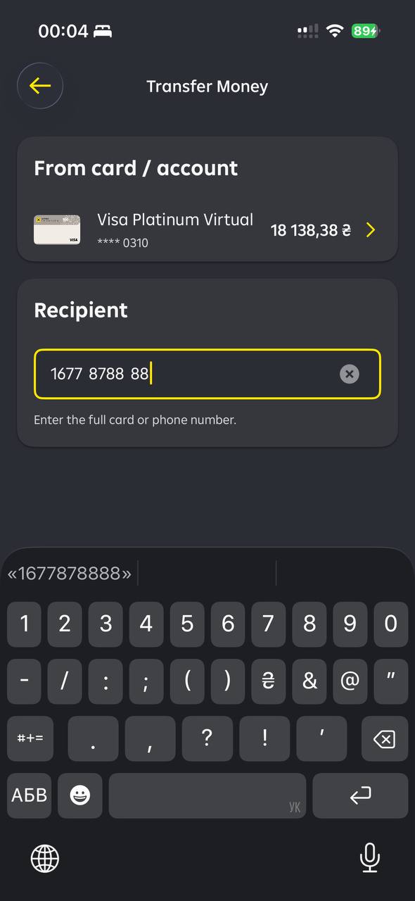
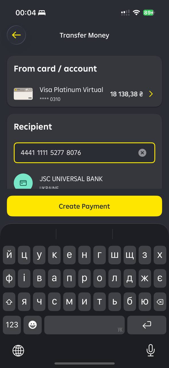
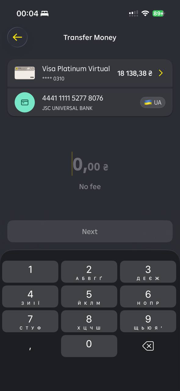
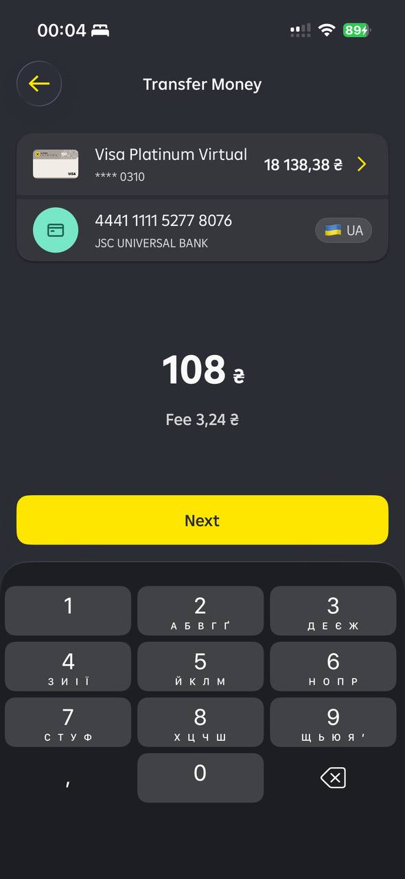
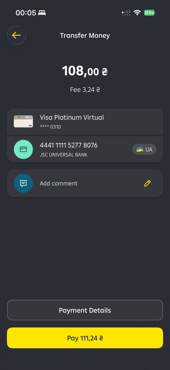
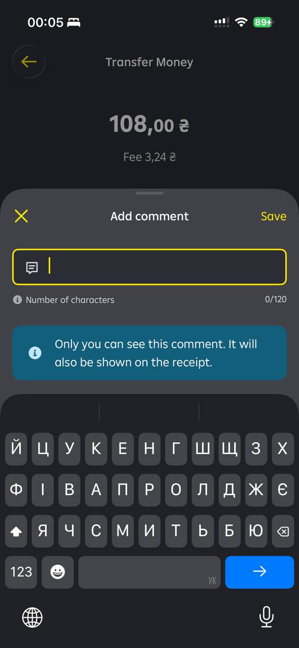
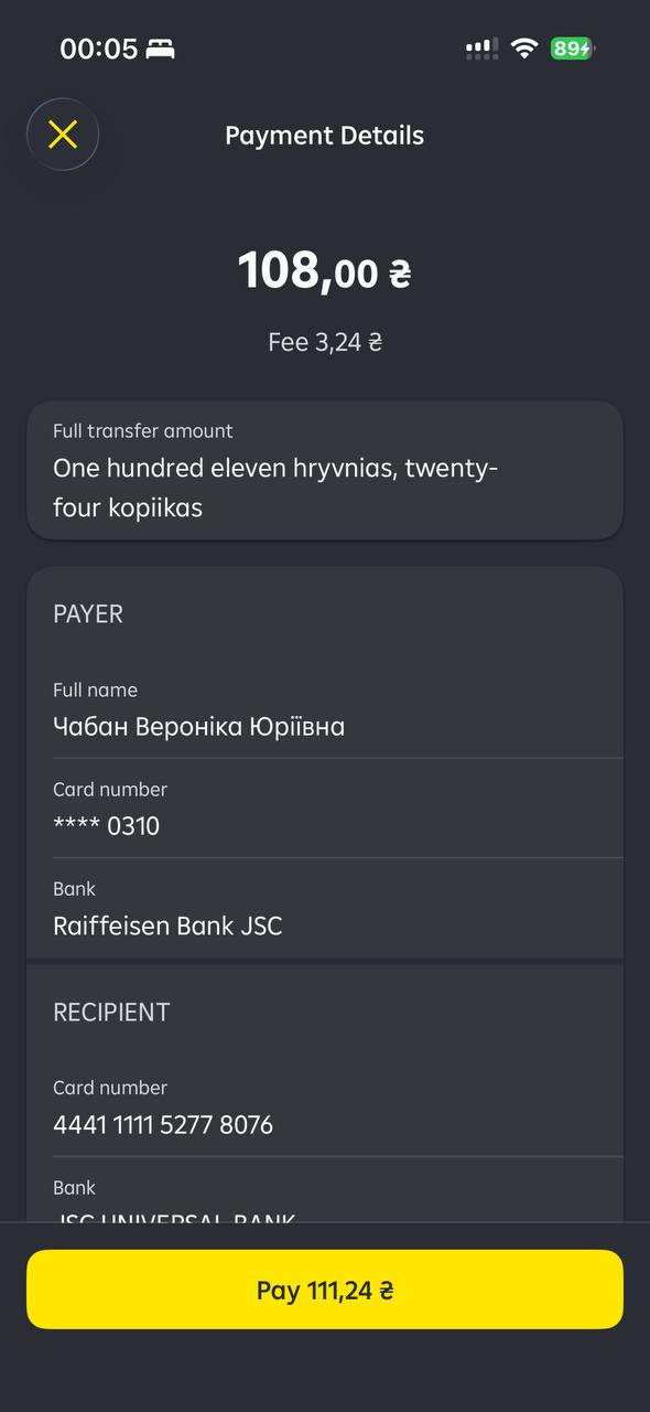
The final redesign brought the measured journey down to approximately 4–5 seconds — roughly 80% faster than the original flow and ahead of the leading local benchmark. It validated the recipient-first architecture as the default path.
12 — Outcome
24 sec → 8–9 sec → 4–5 sec average time on task.
Two design iterations made the core P2P journey approximately 80% faster. The first measurable iteration reached the leading local benchmark, and later refinements surpassed it. The work also created a clearer transfer architecture supporting own-product transfers, contacts and recent recipients, saved templates, manual card entry and future transfer extensions. The redesigned C2C experience later became a standard flow within the bank.
≈80%
Faster than the original flow
Benchmark passed
Iteration 1 matched it, Iteration 2 surpassed it
Standard flow
Adopted inside the bank
13 — Reflection
What this project demonstrates.
- Measurable product thinking: the project started and ended with comparable task-performance data.
- Research depth: benchmarking, interviews, journey mapping and usability testing informed the solution.
- Systems thinking: I redesigned the transfer architecture, not only the final UI.
- Cross-functional facilitation: co-design aligned customer needs with banking constraints.
- Responsible simplification: unnecessary steps were removed without compromising transaction clarity.
- Delivery pragmatism: NFC was explored without blocking improvements shippable on existing infrastructure.