Foxtrot · E-commerce
Redesigning a high-traffic e-commerce experience around real shopping behavior
Using analytics, UX research and usability testing to uncover friction across the shopping journey and help redesign one of Ukraine's largest electronics e-commerce platforms.
- Role
- Growth / Product Designer
- Focus
- Product Discovery · UX Research · CRO · E-commerce
- Timeline
- 4.5 months
- Team
- Growth Design · UI/UX · Art Direction · PM · Development · Client stakeholders
The challenge
This wasn't just a visual redesign.
Foxtrot was already operating at significant scale, with around 5 million monthly views of its online store.
But the shopping experience had accumulated friction across product discovery, comparison, checkout, delivery and payment.
The challenge wasn't simply to modernize the interface. We needed to understand where customers were struggling, why they were dropping out of the journey, and which problems had the greatest potential impact on conversion.
How might we make it easier for customers to find, compare and buy products — without compromising the complexity of a large retail ecosystem?
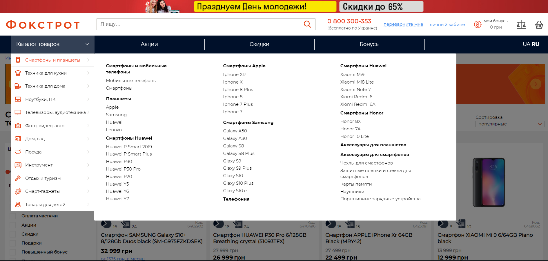
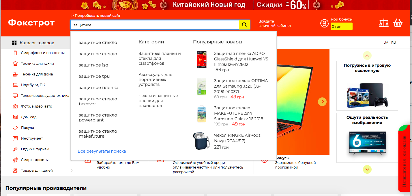
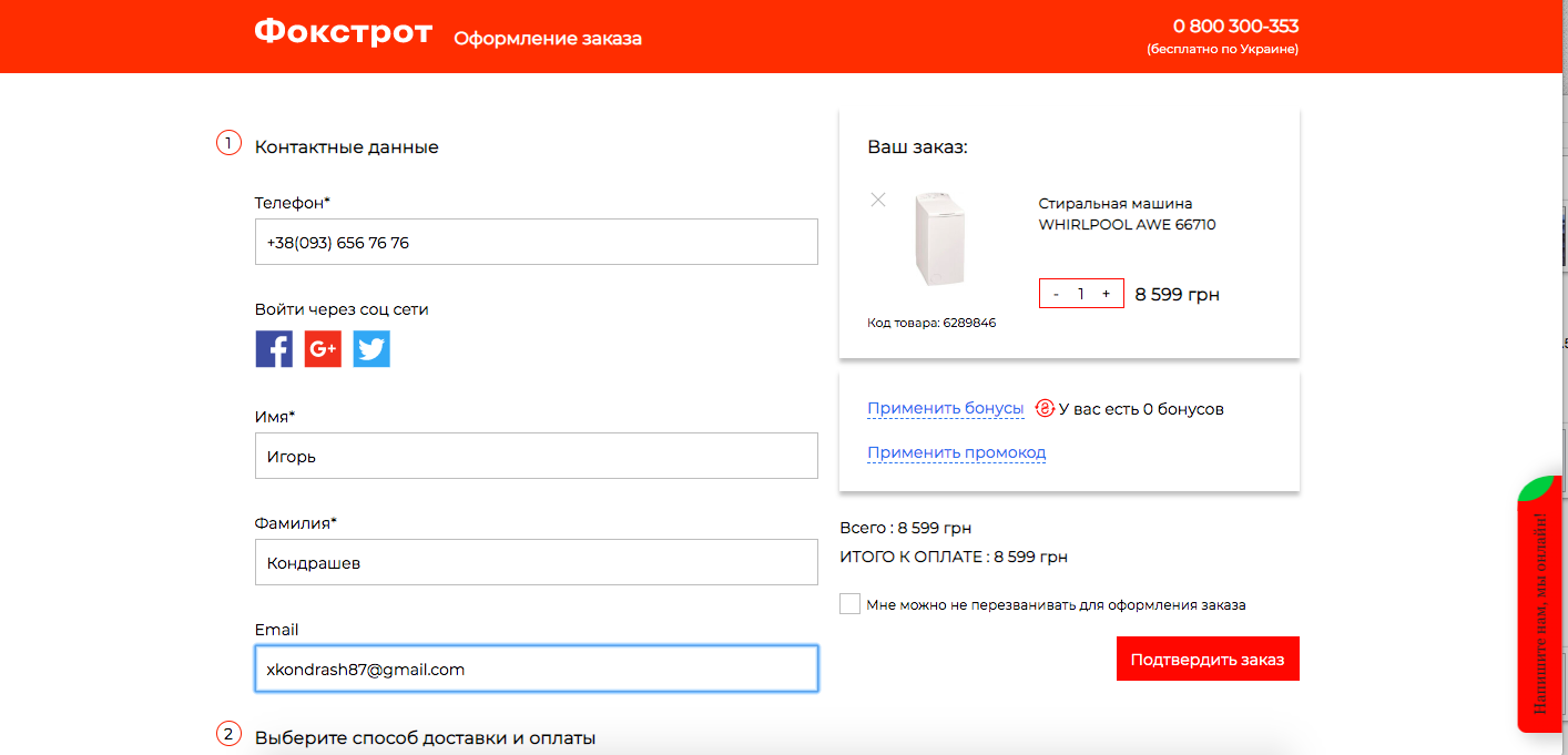
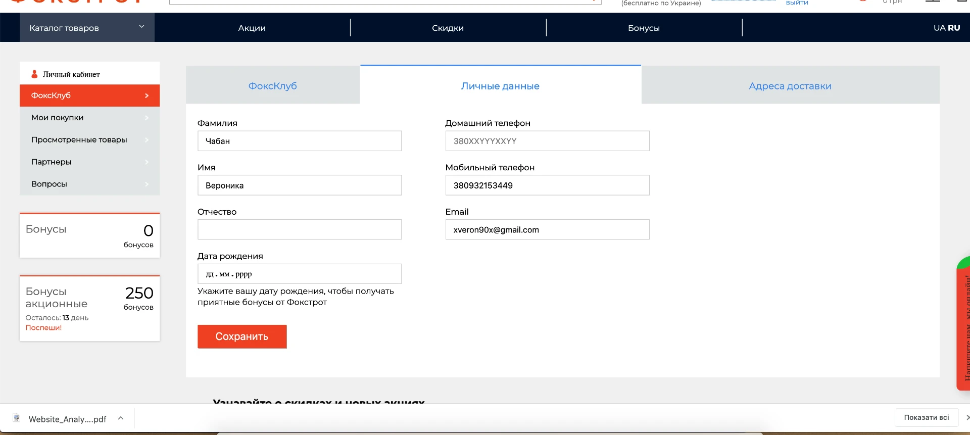
The site before the redesign
The experience we started from.
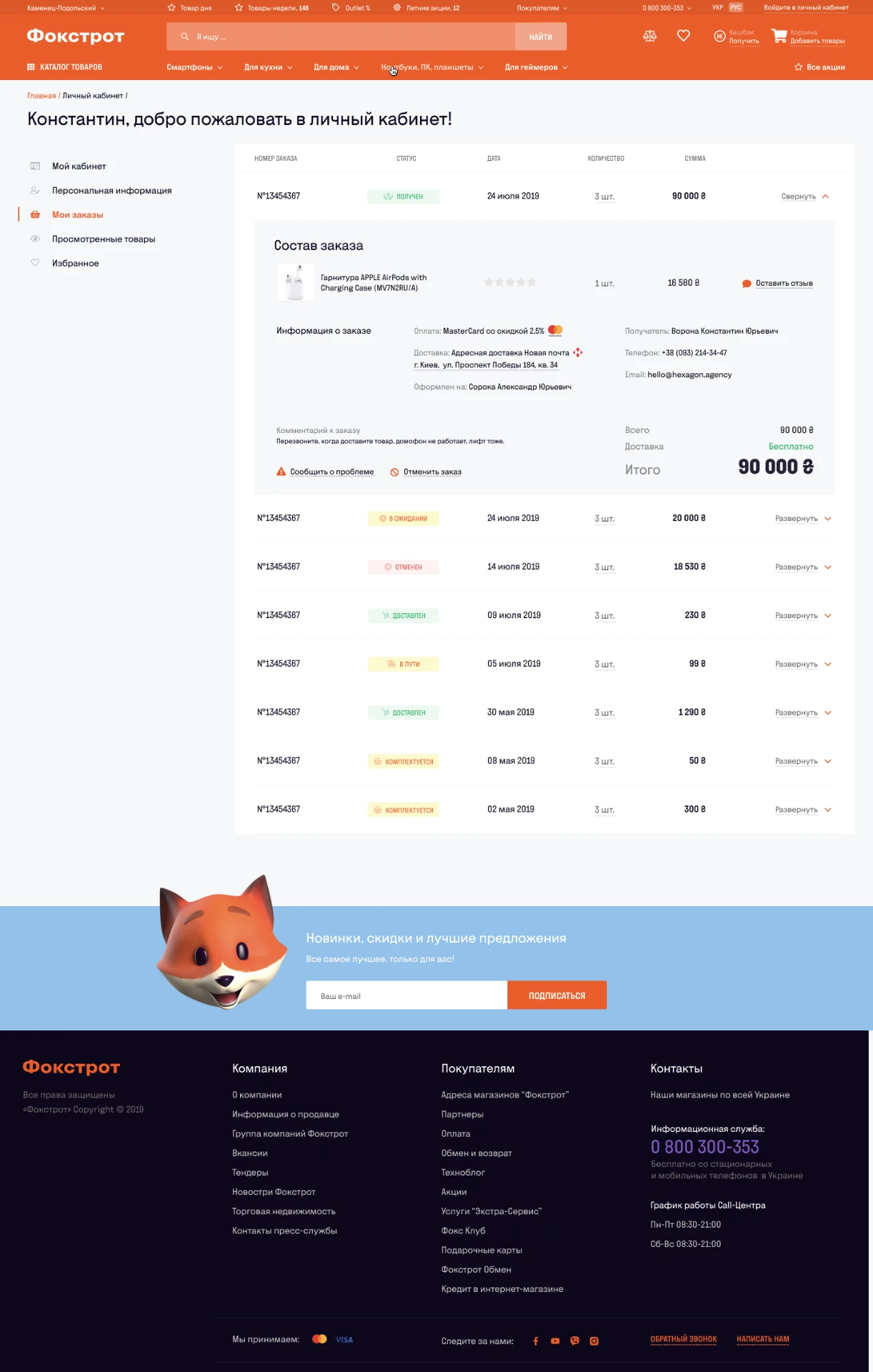
These are the actual screens customers used at the time — catalog navigation, search, checkout, order confirmation and the personal account. The redesign had to work within this live, high-traffic ecosystem, not on a blank canvas.

My role
Working at the intersection of customer behavior and business performance.
I worked on the growth and product discovery side of the redesign. My focus was understanding customer behavior, identifying friction across the purchase funnel and translating evidence into UX and product hypotheses.
- UX Audit
- Analytics
- Research Design
- Usability Testing
- Insight Synthesis
- Hypotheses
- UX Recommendations
The work was done collaboratively with UI/UX designers, developers, project management and Foxtrot stakeholders.
Discovery
Starting with the problems, not the screens.
Before redesigning the experience, we combined multiple sources of evidence rather than relying on assumptions.
UX Audit
Existing flows, interaction patterns, information architecture and usability issues.
Analytics
Behavior across the purchase funnel and signals of abandonment.
User Research
Real customers completing realistic end-to-end shopping journeys.
Competitive Research
Patterns and opportunities across leading e-commerce experiences.
The numbers showed us where users were struggling. Research showed us why.
Behavioral data
The funnel showed clear signs of friction — especially on mobile.
Baseline · before redesign
76.58%
incomplete mobile checkouts
42.75%
unpaid mobile carts
0.56%
mobile sessions with transactions
Analytics gave us signals of where the purchase journey was breaking. The next step was understanding what was happening behind those numbers.
Usability testing
We tested complete shopping journeys — not isolated screens.
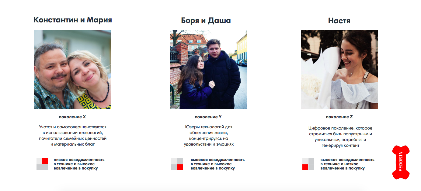
30 participants across three age groups completed realistic shopping scenarios on mobile and desktop.
Instead of asking people whether they liked individual screens, we observed them finding products, comparing alternatives, choosing delivery and payment, using credit and completing purchases.
30
participants
3
age groups
3
end-to-end scenarios
2
device contexts
What we measured
- Task Success Rate
- Time on Task
- User Error Rate
- Number of Clicks
- SUS Usability Score
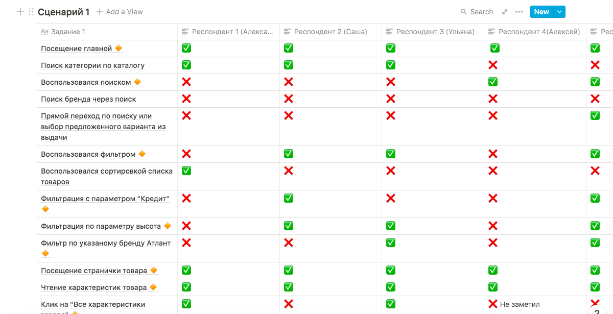
Each participant received one end-to-end scenario matched to their device, and every session was screen-recorded with Lookback. We tracked each journey stage by stage — from homepage to the thank-you screen — measuring time, clicks, errors and success at every step.
Measuring the experience
A measurable baseline before touching the design.
Breaking each journey into individual stages allowed us to measure where customers slowed down, made errors or failed to complete a task.
Baseline usability results · before redesign
68.4%
Task success · Scenario 1
67%
Task success · Scenario 2
72%
Task success · Scenario 3
77.5
SUS usability score
The data told us where.
Watching people shop told us why.
What we learned
The problems weren't isolated. They formed patterns across the shopping journey.
01
Discovery
Different customers searched in fundamentally different ways.
Some customers relied on search to get to a product quickly. Others navigated through the catalog and filters.
Both journeys contained friction: inconsistent search results, buried filter parameters and unclear mobile interactions.
Search and navigation weren't secondary utilities. They were core shopping journeys.
02
Purchase context
Critical information appeared too late.
Customers could move deep into the purchase journey before discovering that a product couldn't be paid for by card, wasn't available for the expected delivery method, or could only be collected from a specific store.
Purchase constraints should appear when customers make the decision — not after they've made it.
03
Checkout
The biggest checkout problem was uncertainty.
Customers repeatedly scrolled through checkout to verify their information.
Weak validation and the absence of a persistent order summary made it difficult to understand whether everything had been entered correctly.
Even after placing an order, customers couldn't easily verify the details they had submitted.
Confidence is part of conversion.
04
Credit
“Buy on credit” meant something different to the system and the customer.
Customers assumed that choosing “Buy on credit” had already placed them inside a credit purchase flow.
Later, checkout asked them to choose payment again. Some accidentally selected cash while still believing they were completing a credit purchase.
Users also struggled to understand the difference between credit and installment payments.
Once a customer makes a financial choice, the interface should preserve that context throughout the journey.
Design strategy
Turning research into product principles.
01
Make discovery faster
Search, catalog and filters should support different shopping behaviors equally well.
02
Surface constraints early
Availability, delivery and payment limitations should be visible before checkout.
03
Reduce uncertainty
Customers should always understand what they've selected, what happens next and whether their information is correct.
04
Preserve context
Choices made earlier in the journey — particularly credit, delivery and payment — should remain clear throughout checkout.
05
Design for mobile reality
Several of the most critical usability problems became significantly more visible on smaller screens.
Information architecture
Before simplifying the interface, we mapped the complexity behind it.
Foxtrot wasn't a greenfield product.
The platform included a large catalog, search, comparison, promotions, loyalty, personal accounts, checkout, credit, delivery, support and multiple product components.
We mapped the existing ecosystem, component architecture and core use cases before defining a clearer structure for the redesigned experience.
Before
The existing Foxtrot ecosystem, mapped as it actually worked.
Restructured
A clearer structure defined for the redesigned experience.
Simplifying the experience required understanding the system first.
The redesign
From behavioral friction to a clearer shopping experience.
A
Search & discovery
Helping customers reach relevant products faster, regardless of whether they start with search or exploration.
B
Product selection
Bringing the information customers need for a purchase decision closer to the moment they need it.
C
Checkout
Reducing uncertainty through clearer hierarchy, context and confirmation throughout the purchase flow.
D
Mobile experience
Designing the core shopping journey for the constraints and behavior we observed on mobile.
The redesigned experience
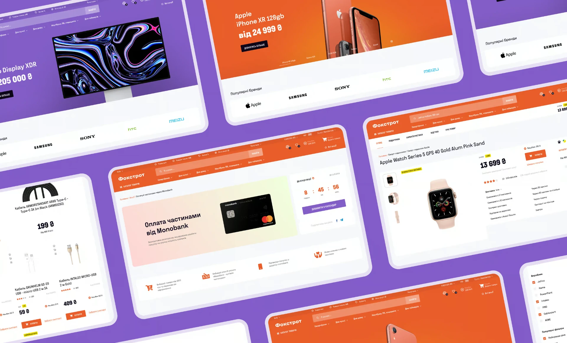
What the new Foxtrot looked like.
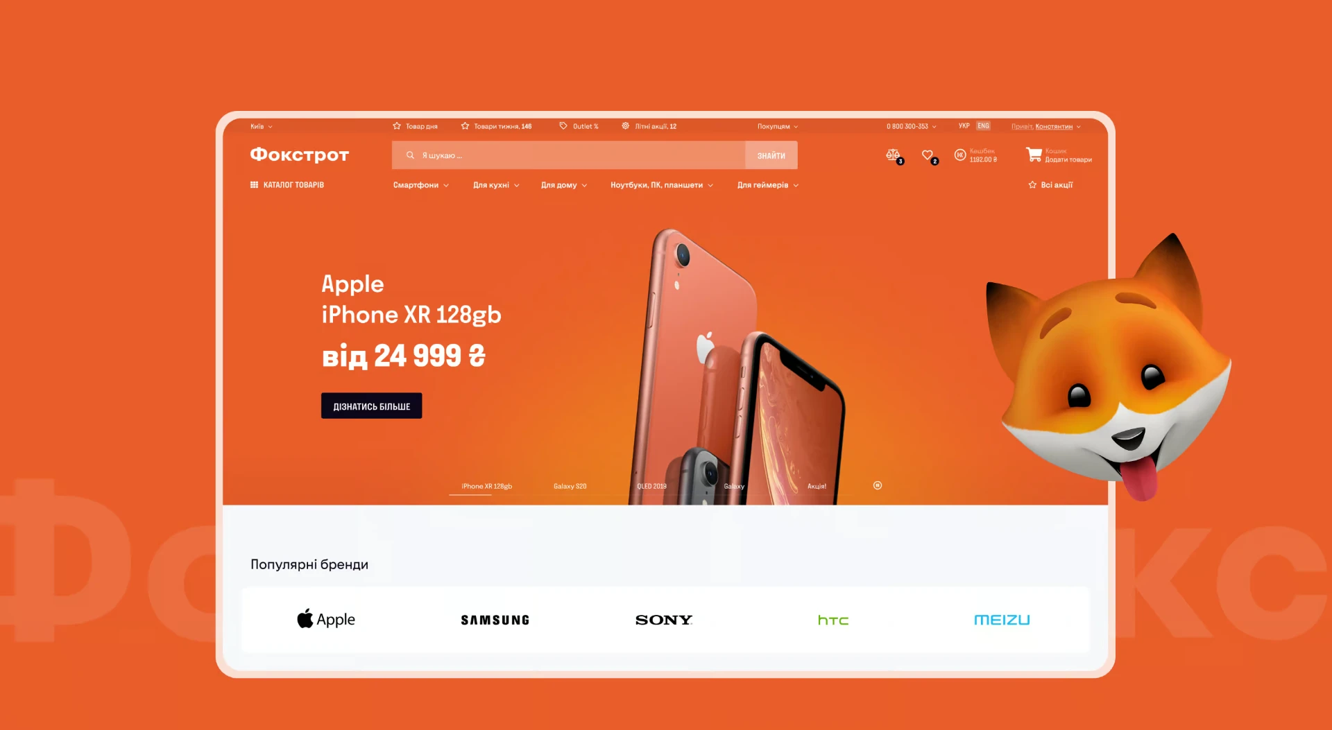
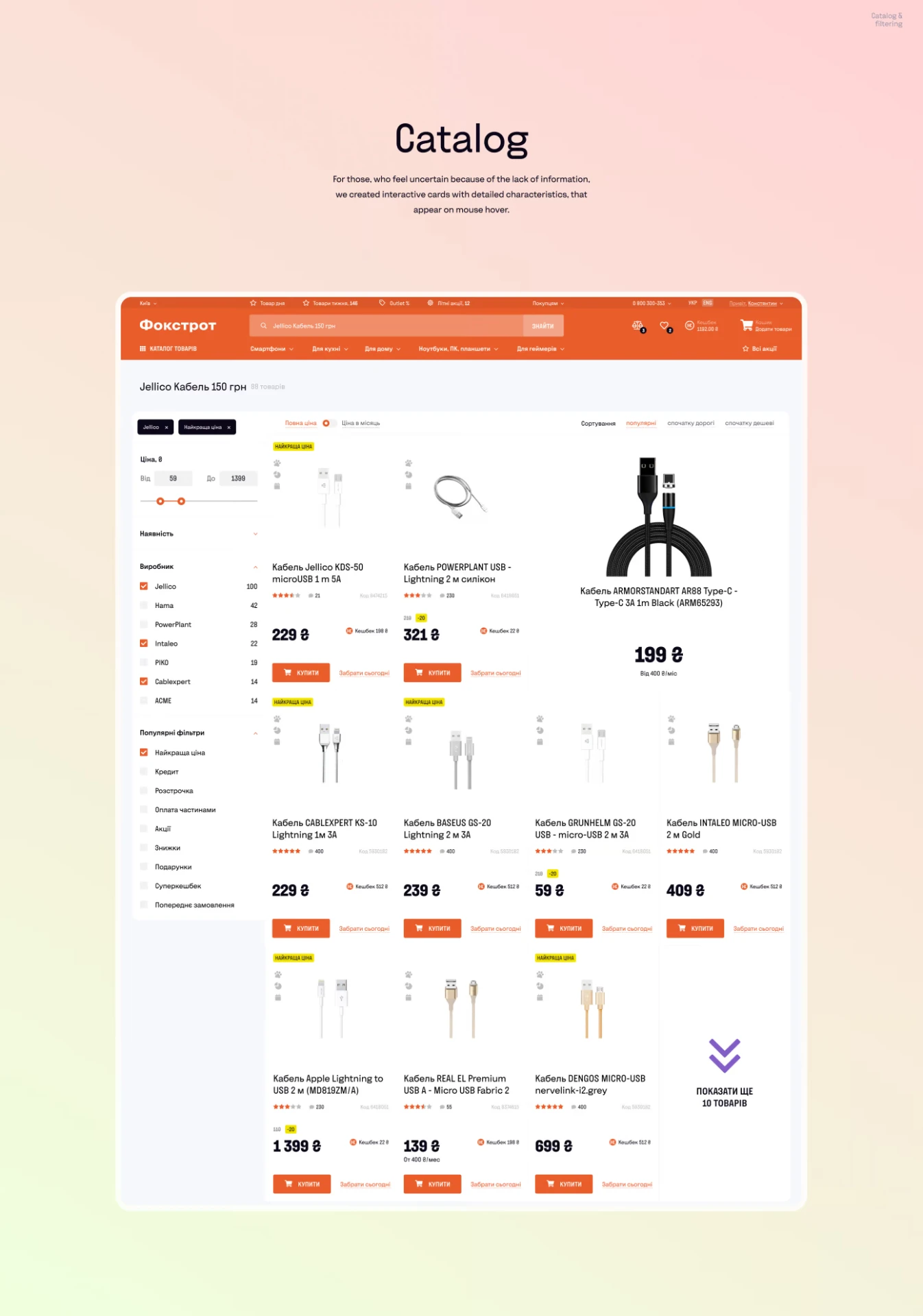
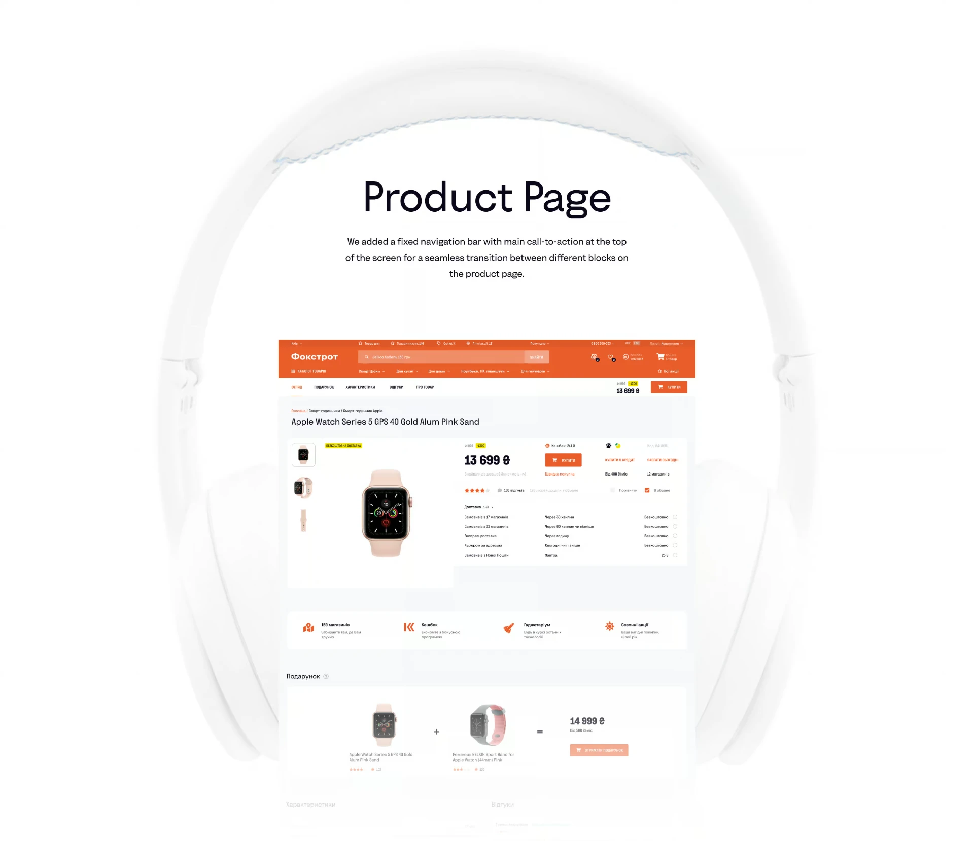
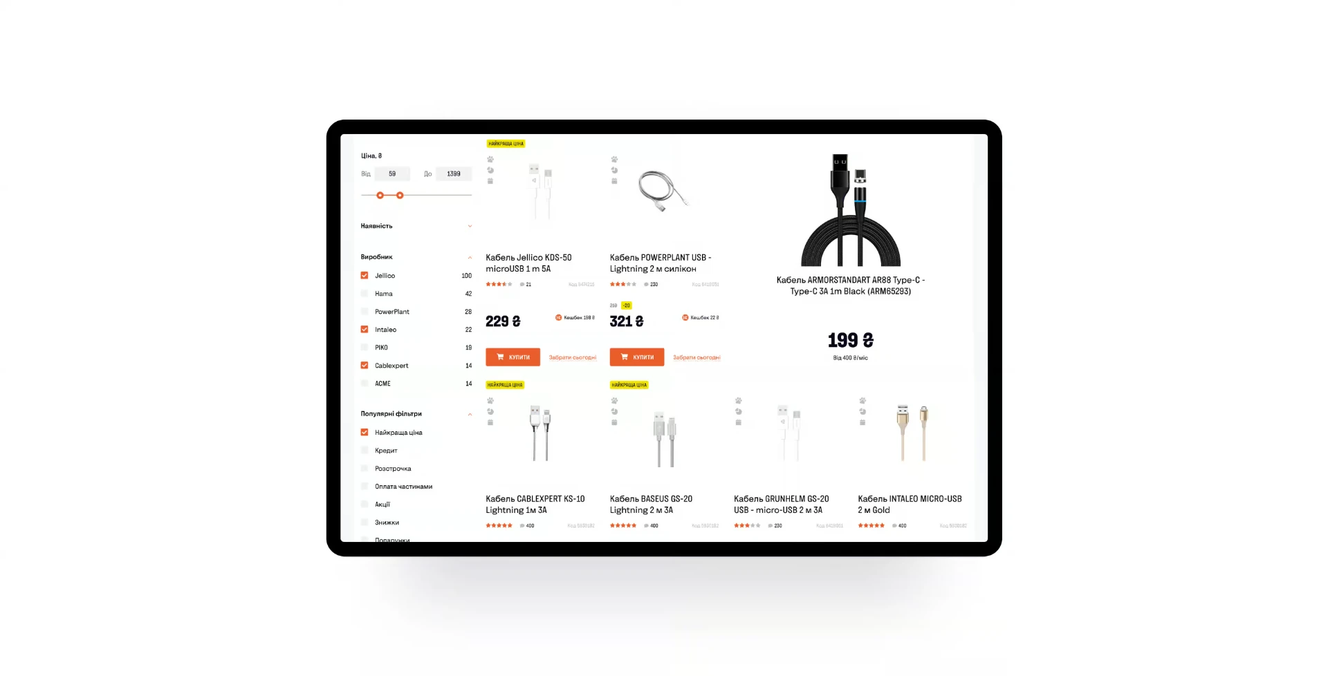
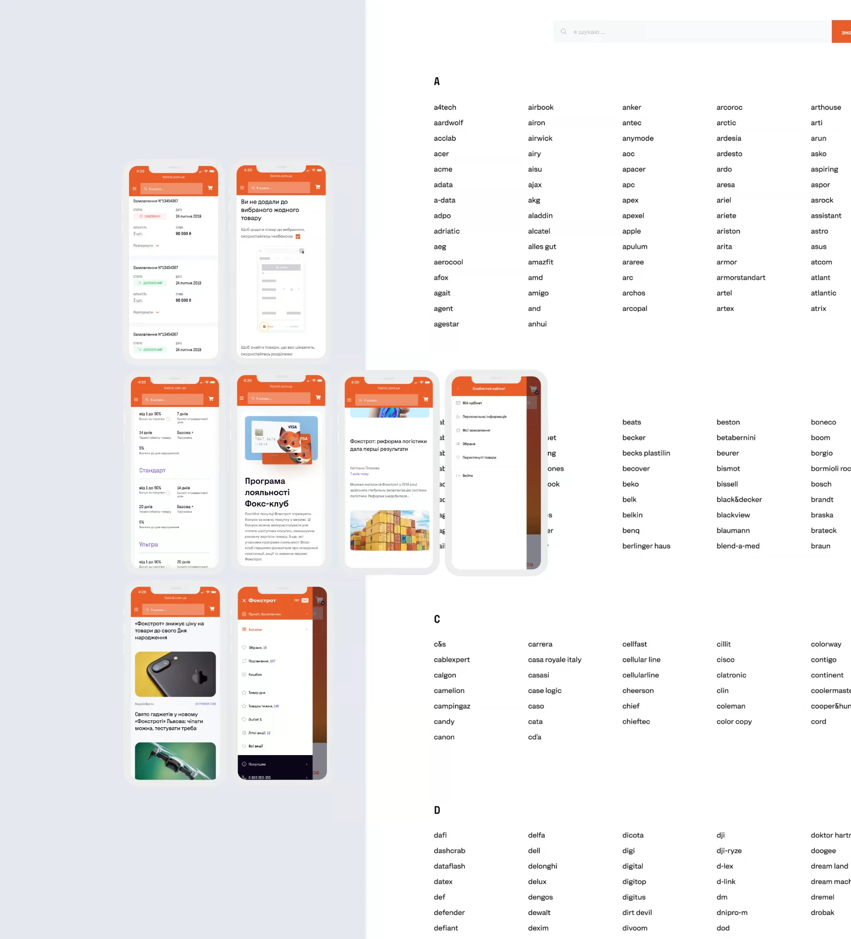
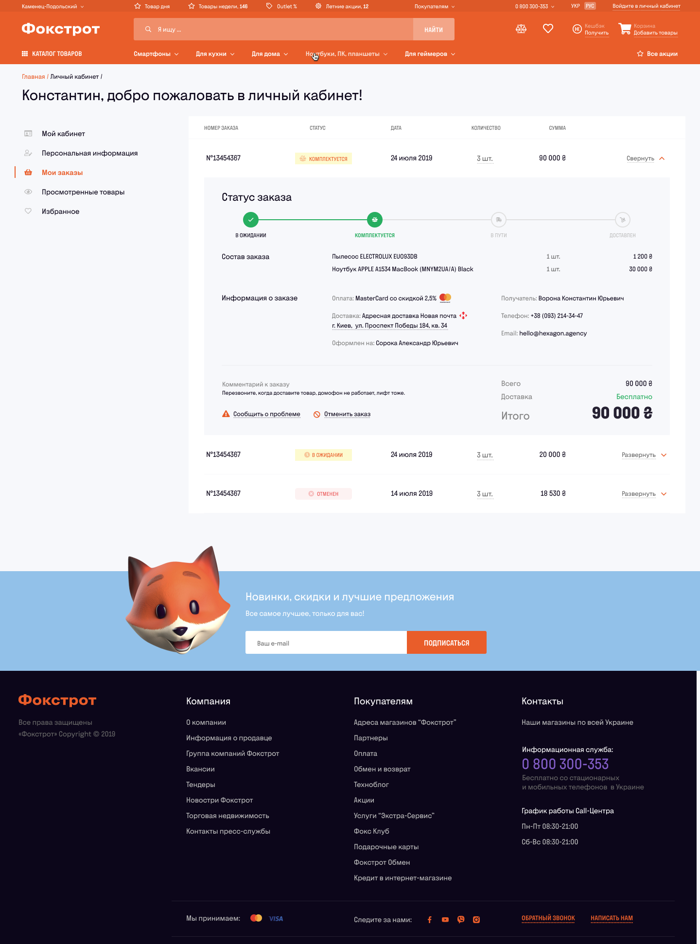
The redesigned Ukrainian interface brought clearer navigation, more scannable catalog pages and stronger product presentation across desktop and mobile.
System thinking
A redesign that had to work beyond a single flow.
Foxtrot's experience was built from a large ecosystem of reusable product, navigation, promotional and content components.
Mapping those components helped us create a more consistent experience while keeping the system flexible enough for a large retail catalog and frequent commercial campaigns.
Beyond the transaction
What happens after the purchase?
Research also exposed an opportunity beyond fixing the immediate funnel.
The customer account could evolve from a passive order-history page into a personalized ownership and loyalty experience.
My products
Purchased devices, manuals, active warranties and connected services.
Personalized experience
Offers informed by purchase history, wishlist and customer preferences.
Loyalty progression
Increasing engagement could unlock additional benefits, services and rewards.
Post-purchase care
Reviews, warranty reminders, relevant accessories and support history.
These were product and growth opportunities explored during the project, not all shipped features.
Outcome
A tested redesign grounded in customer behavior.
After 4.5 months, the team delivered a tested redesign covering the core e-commerce journey — from product discovery and navigation to product selection and checkout.
The project established a clearer foundation for Foxtrot's evolving digital commerce experience while giving the team a research-backed framework for continued optimization.
4.5 months
From discovery to tested redesign
30 users
Real shopping journeys observed
End-to-end
Discovery → comparison → checkout → purchase
Reflection
Small UX problems aren't always small business problems.
One of the biggest lessons from Foxtrot was how seemingly minor interaction issues could compound across a high-traffic purchase funnel.
A confusing payment label, missing validation state or unclear availability rule may look small in isolation.
At scale, each one can become a reason for customers to hesitate, contact support — or abandon the purchase entirely.
Don't redesign what looks broken.
Find where behavior breaks first.