Fishka · Loyalty ecosystem · Mobile
Making a multi-partner loyalty program feel like one simple idea.
Fishka connects OKKO with a broad partner network — retail, banking, mobility, pharmacies, food and services. The redesign challenge was never visual modernisation. It was architectural: making a complex, partner-driven loyalty system understandable in a single mental model — earn, keep, spend.
Role
Senior Product Designer
Scope
Product architecture · IA · UX · UI
Platform
iOS & Android loyalty app
Focus
Mental model · Hierarchy · Personalisation
01 — The app today
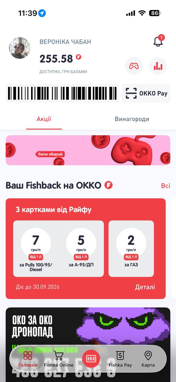
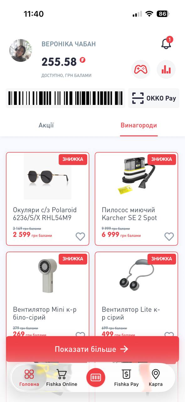
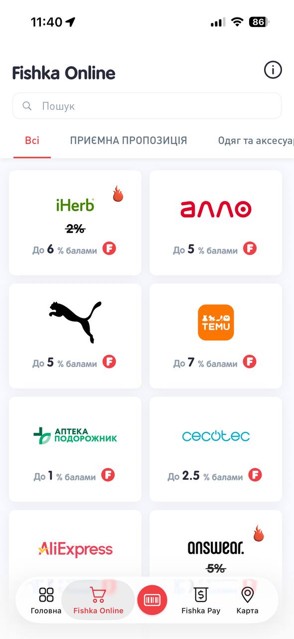
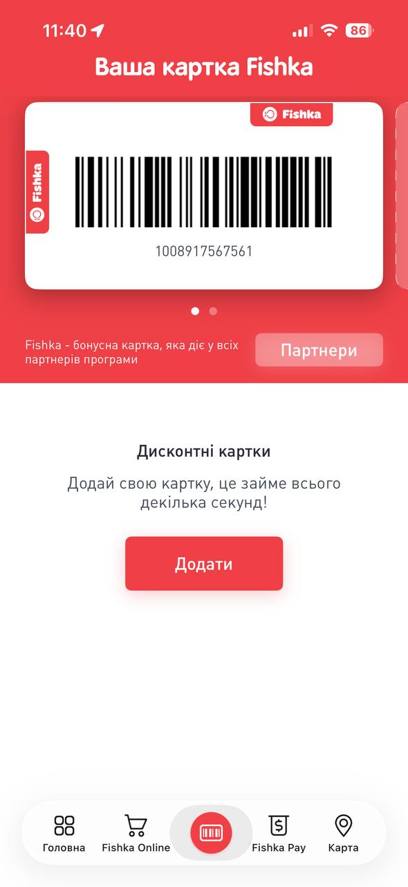
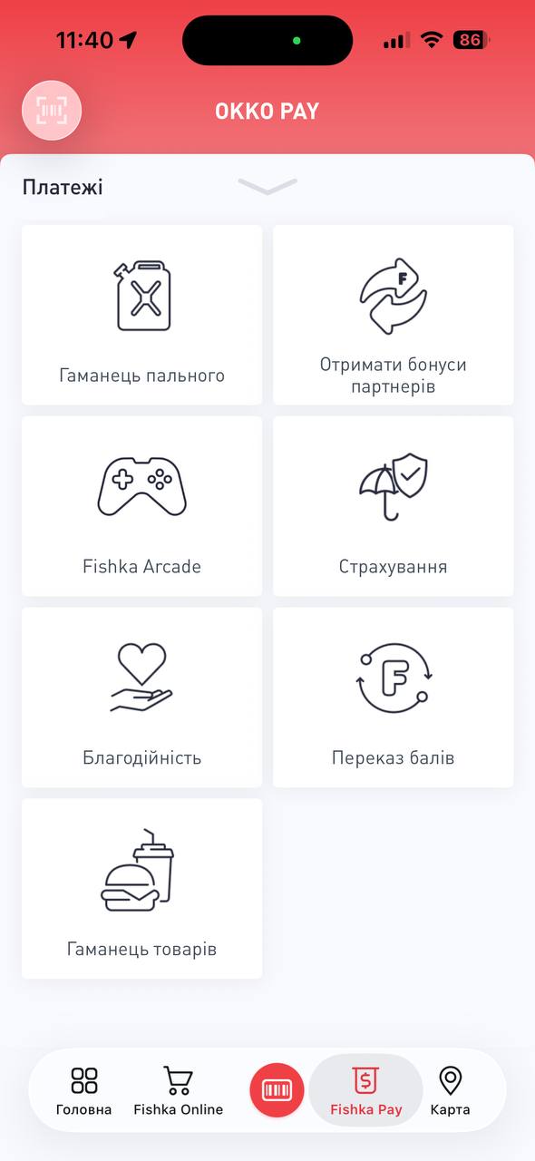
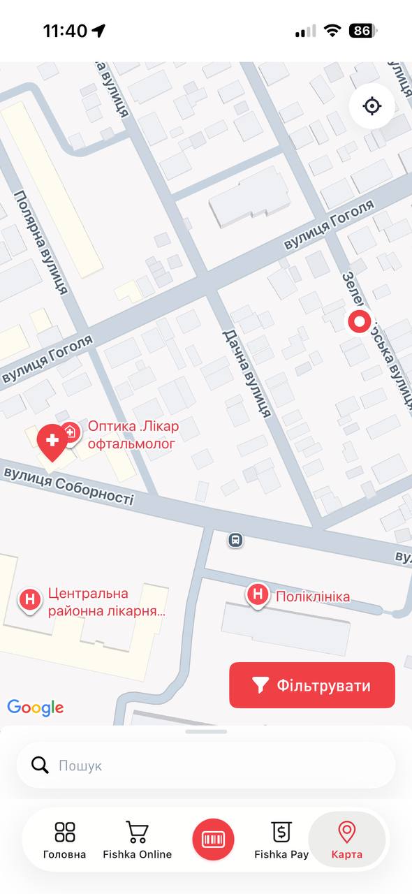
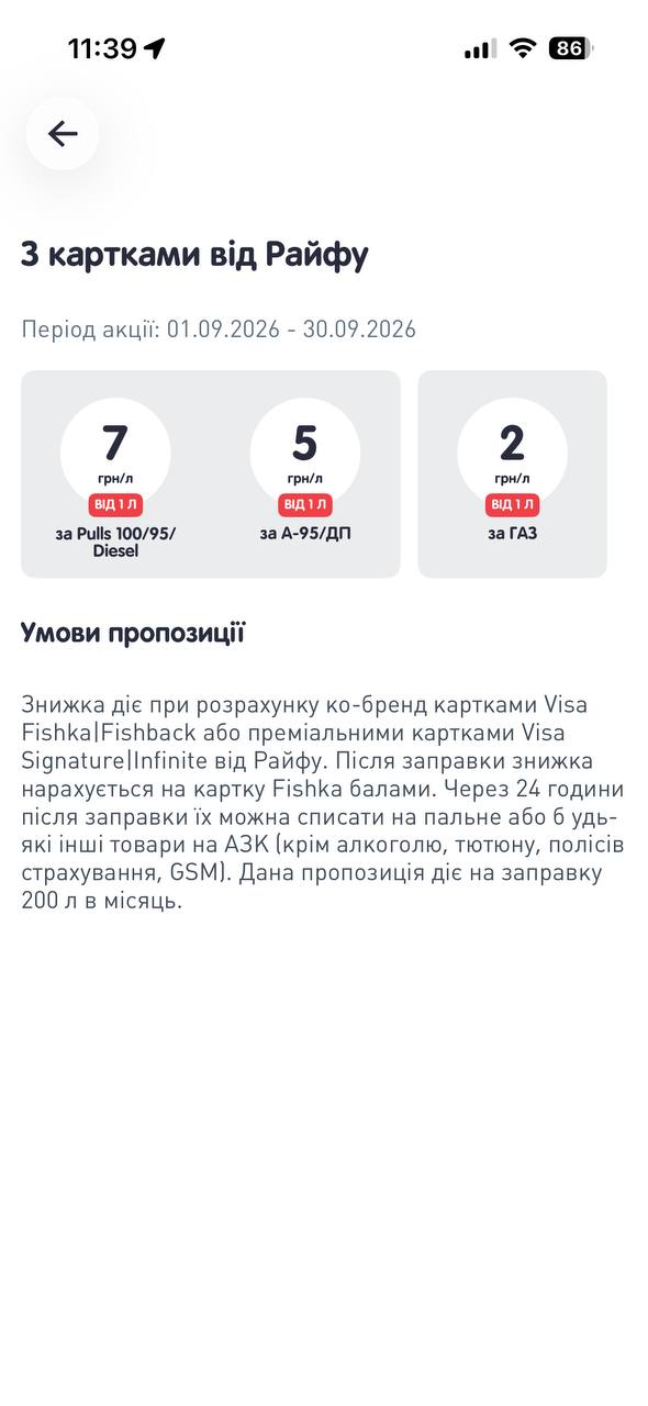
This is how Fishka looks before the redesign.
These are the current production screens. They are not my design — they are the starting point I audited. Everything the program can do is already here; the problem is that the user has to assemble it themselves.
02 — What the audit showed
The complexity isn't in the features. It's in the model.
Five parallel entry points
Home, Fishka Online, the card, Fishka Pay and the map each open their own logic instead of one loyalty flow.
Earning rules live per partner
Every brand, fuel type and co-brand card carries its own rate and condition. The system never sums up to “what do I get”.
Points without a purpose
The balance is visible everywhere, but the app rarely says what it is worth right now, right here.
Promo over context
Campaign banners and catalogues fill the space where a personalised “your next benefit” should be.
The app answers “what campaigns exist?”. Users are asking “what do I have, and what is it worth to me today?”
03 — Product architecture
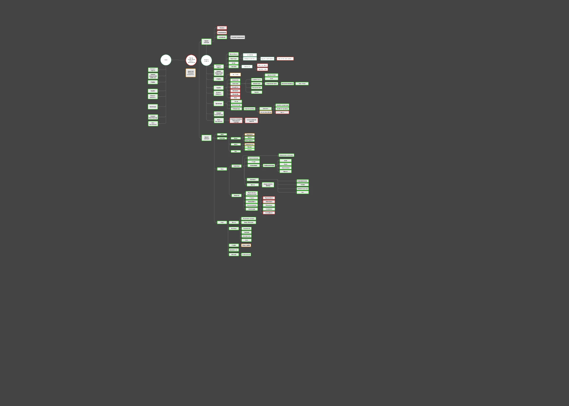
One ecosystem, dozens of intersecting services.
The map below is the redesigned architecture we used to make sense of the system. It shows how Fishka, OKKO, partners, payments and rewards connect — and why the interface had to separate the contexts before users could understand the whole.
03b — Visual identity
A new identity stretched over the redesign.
In parallel with the product work, Fishka rolled out a new brand language: sculpted 3D objects, a saturated Fishka red, bold speech-bubble typography and flat colour blocks. The redesign had to carry this identity into the product without letting decoration compete with the loyalty mechanics.
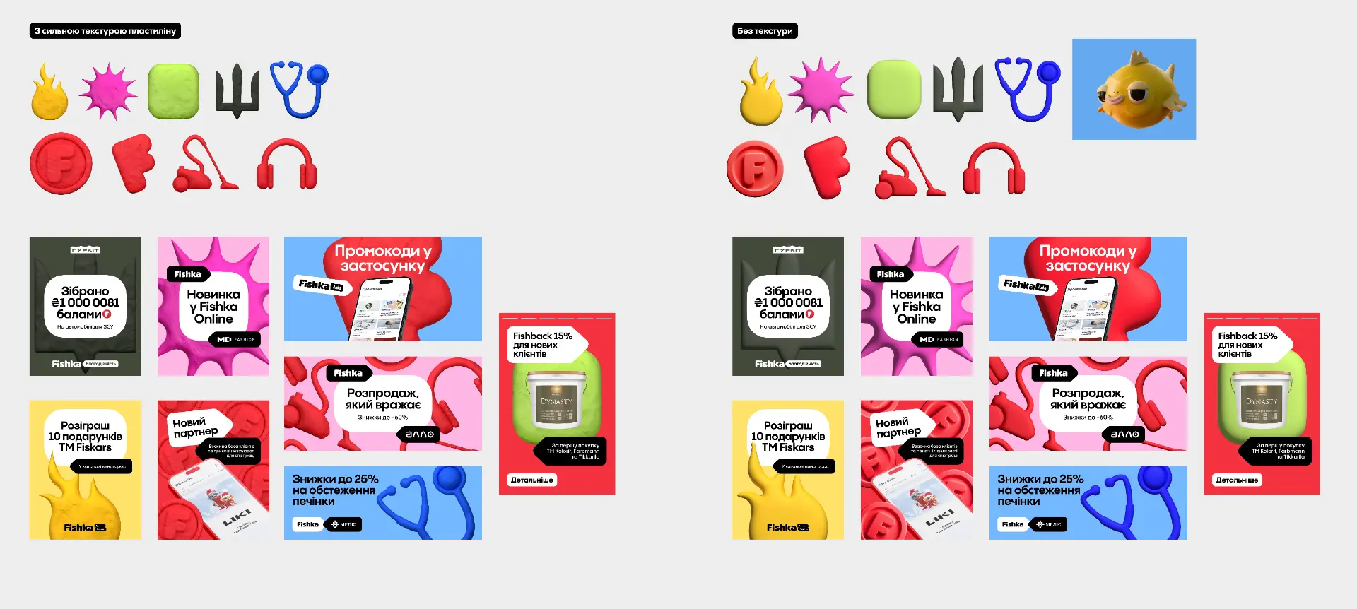
3D objects
Each category — fuel, health, home, retail — gets a tactile object instead of a flat icon, so partner groups become recognisable at a glance.
Texture decision
Two treatments were compared: strong clay texture versus a smooth surface. The smoother set holds up better at small sizes inside the app.
Red as structure
Fishka red marks value and action; everything else stays quiet so balance, rewards and offers keep the hierarchy.
03c — Fishback card
Rebuilding the Fishback card inside marketing's format.
The fuel Fishback card is where users check what they earn per litre. The existing version was built around a rigid communication format that marketing had already prepared and aligned across channels — so the redesign could not change the shape freely, only make the meaning clearer inside it. I explored many approaches for how rates, sources and activation states could read at a glance before landing on the final structure.
Before — Fishback on OKKO
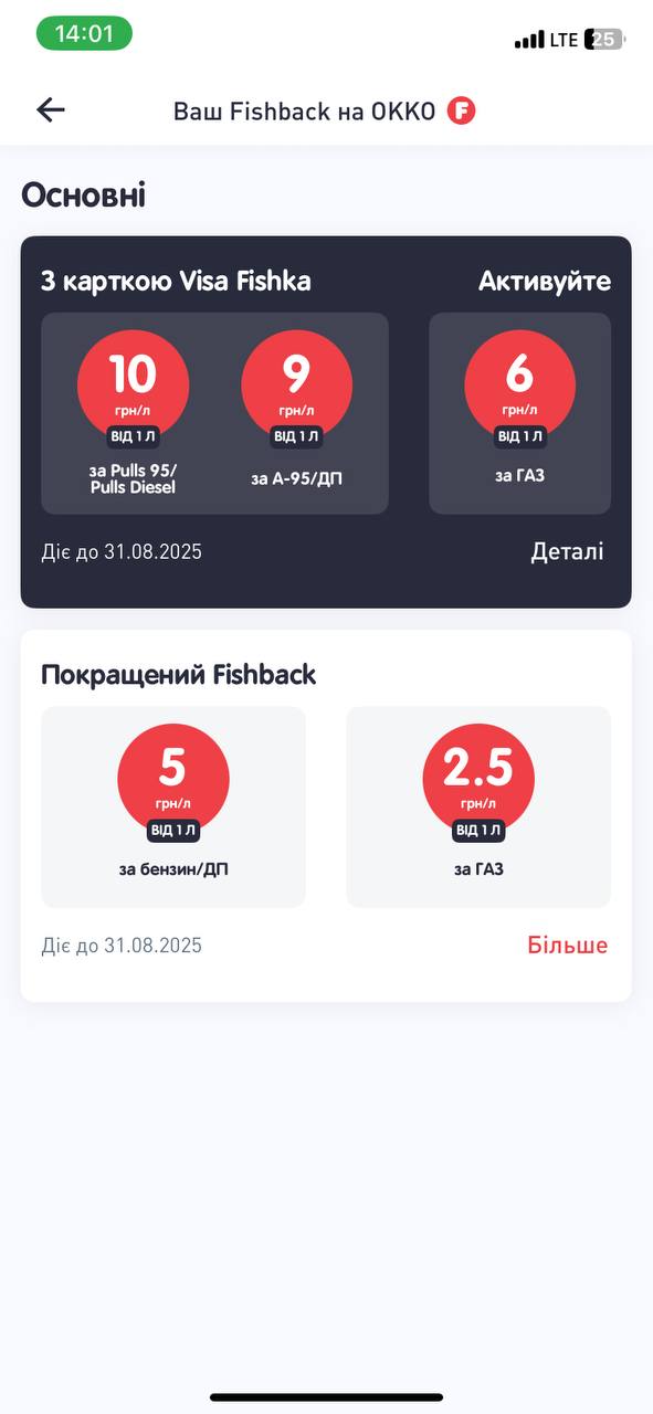
Rates are split into “Basic” and “Improved” blocks. What is active, what is a promo and what adds together is left for the user to decode.
Before — Fishback card detail
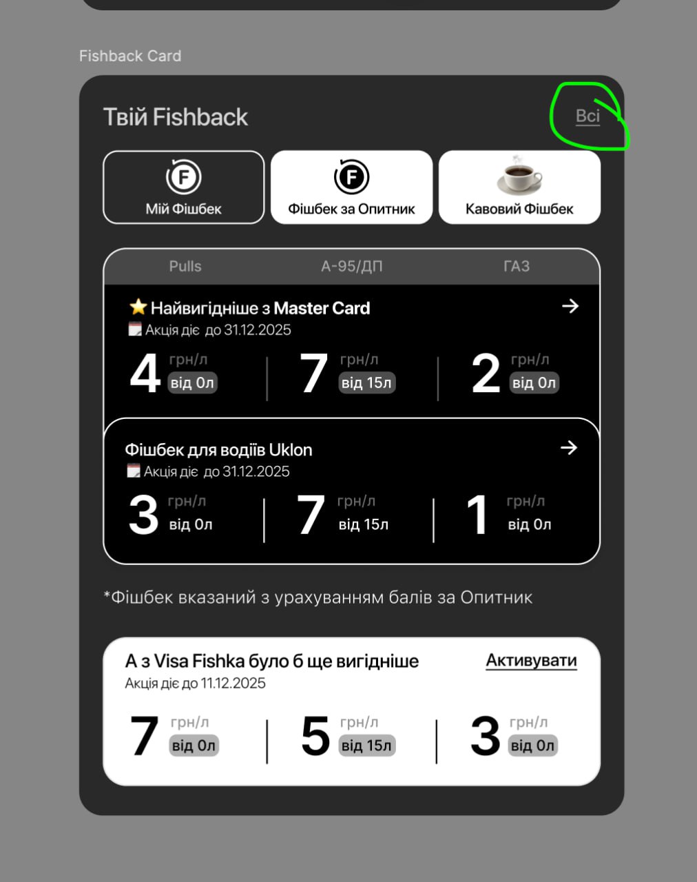
Multiple sources — MasterCard, Uklon, surveys, Visa Fishka — each presented as its own row with its own rules, all competing inside one card.
Explorations — one format, many readings
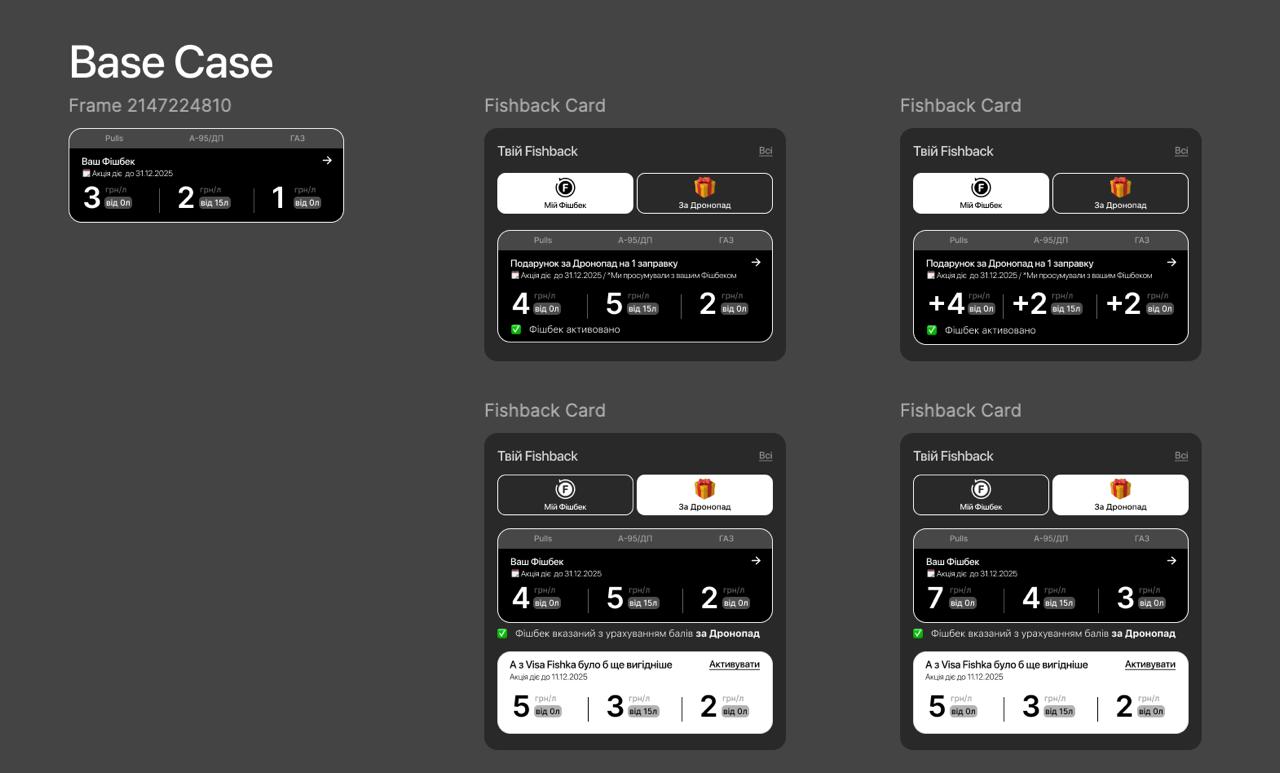
Iterations on the same constrained layout: how to show “my Fishback” versus partner sources, how to surface the Dronopad gift, when to show the combined rate and when the breakdown — all while keeping the communication block marketing had already committed to.
Cross-sell while refuelling
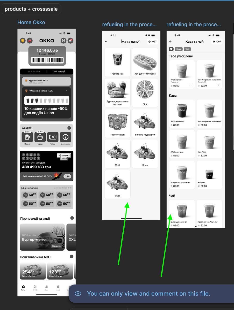
While the fuel is flowing, the app offers the café catalogue — turning wait time into order time.
Reward bottom sheet & promo history
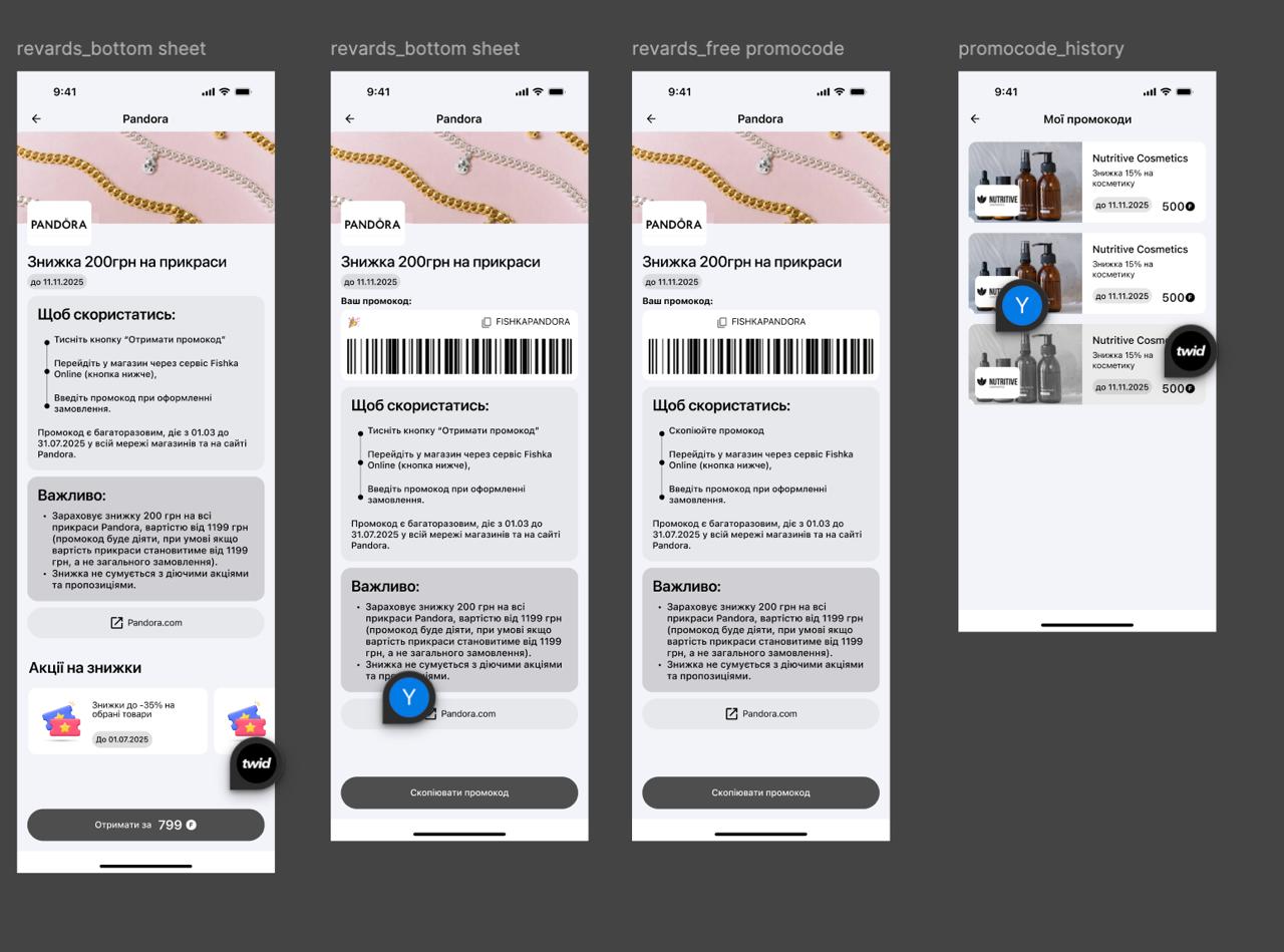
Getting a partner reward ends in a promocode with clear states — available, copied, archived — so the value stays findable after the moment of redemption.
Reward order — paying with points
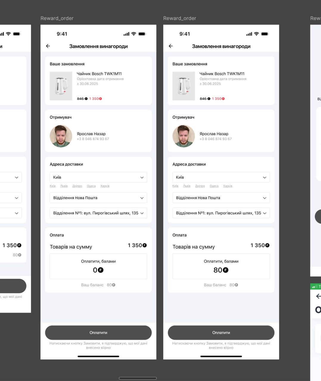
Ordering a physical reward mirrors a familiar checkout — item, recipient, Nova Poshta branch — with the points balance shown where the payment would be.
04 — The direction
Three states instead of five destinations.
Rather than five parallel sections, the redesign organises the whole ecosystem around one loop the user already understands intuitively.
Earn
Every partner, fuel type and co-brand rule collapses into one answer: how points come to me.
Keep
One balance with a clear identity — value, not a number floating above banners.
Spend
Rewards, fuel, partners and payments read as ways to use the same balance.
The ecosystem stays as wide as it is. Only the way it is presented narrows — from many rule sets to a single, contextual statement of value.
05 — Structure first
Make Fishback understandable before making it beautiful.
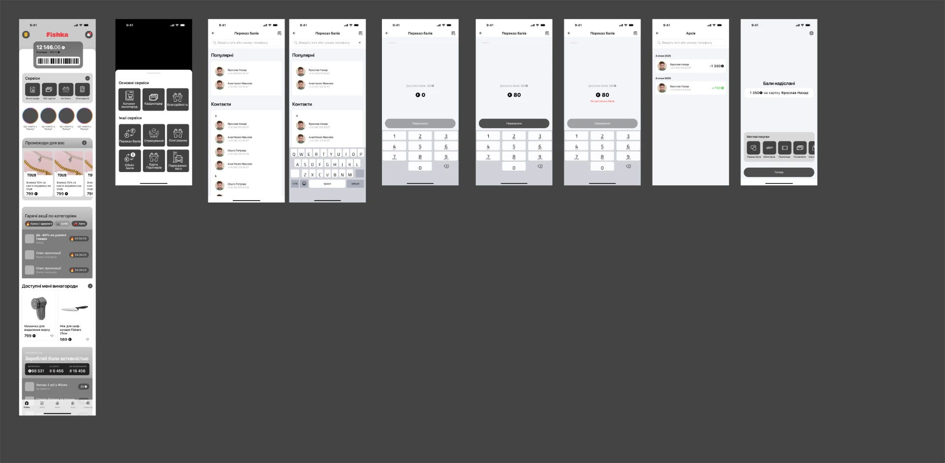
The core flows were worked out in grayscale: available versus reserved points, the transaction list, transaction detail, statistics by category and partner, the rewards catalogue, the cardholder and the points-transfer flow. Structure and wording carried the meaning; visual style came after.
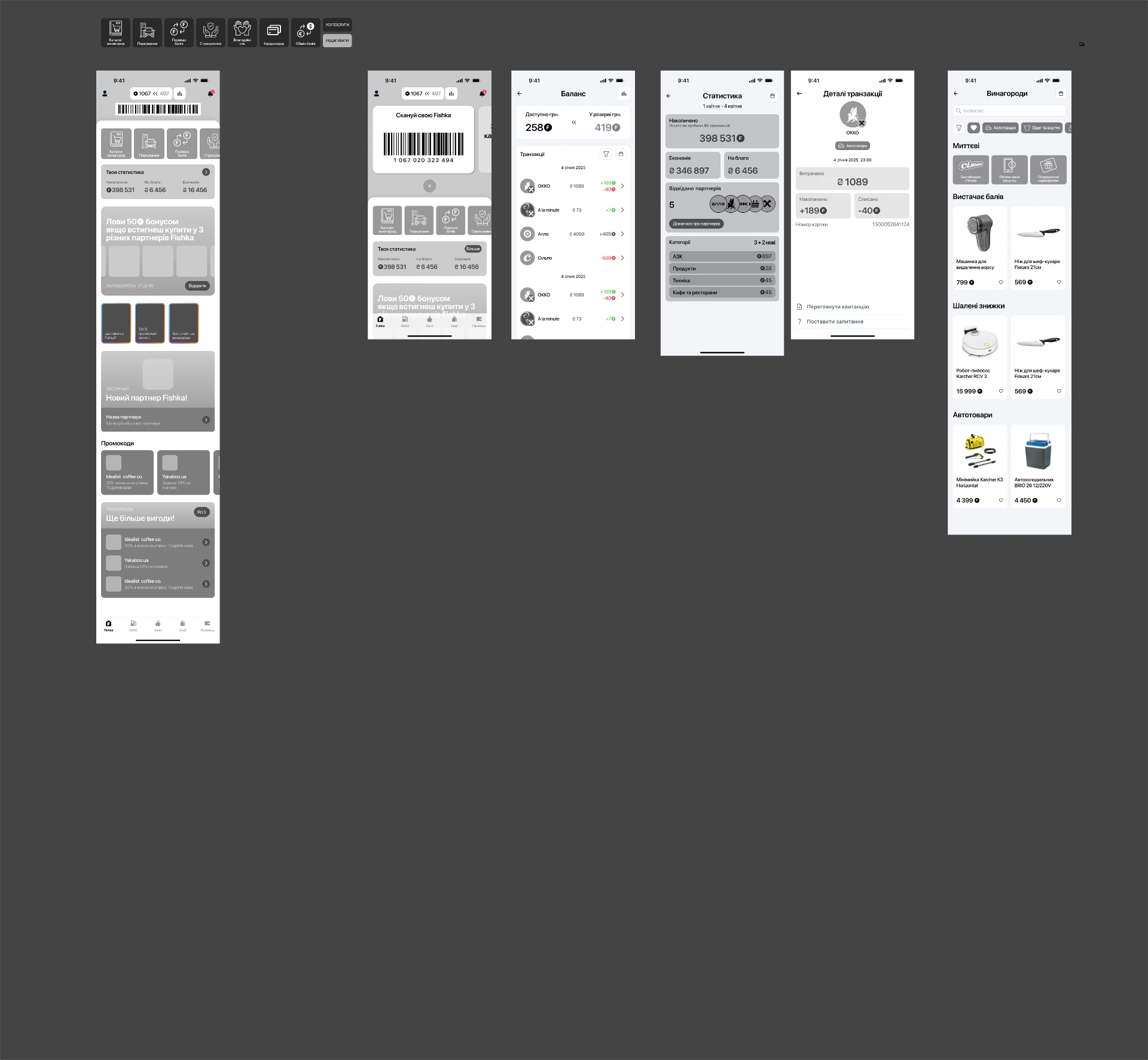
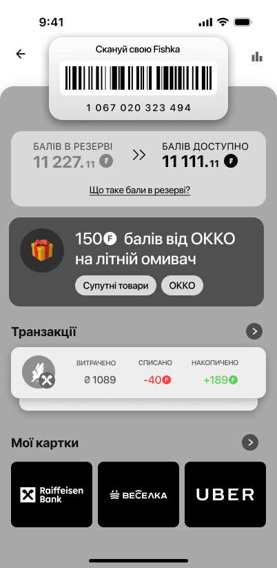
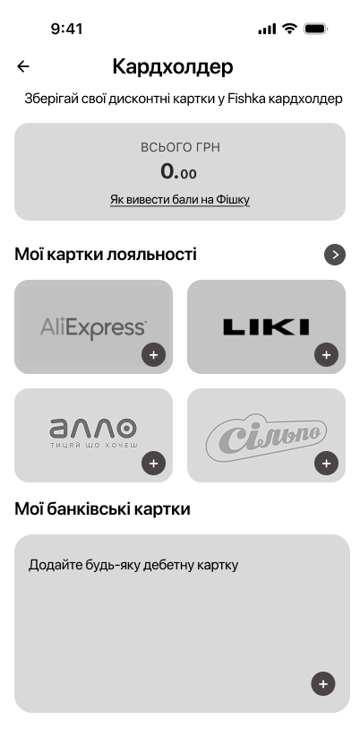
The reward lifecycle is stated in the interface instead of being inferred from a single number.
06 — Identity applied
The new brand language on top of the new structure.
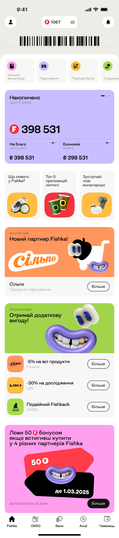
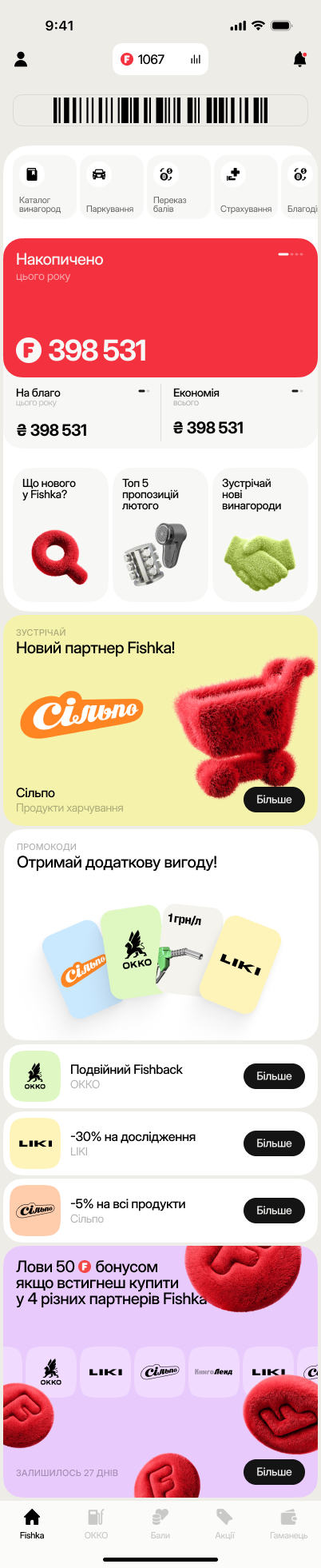
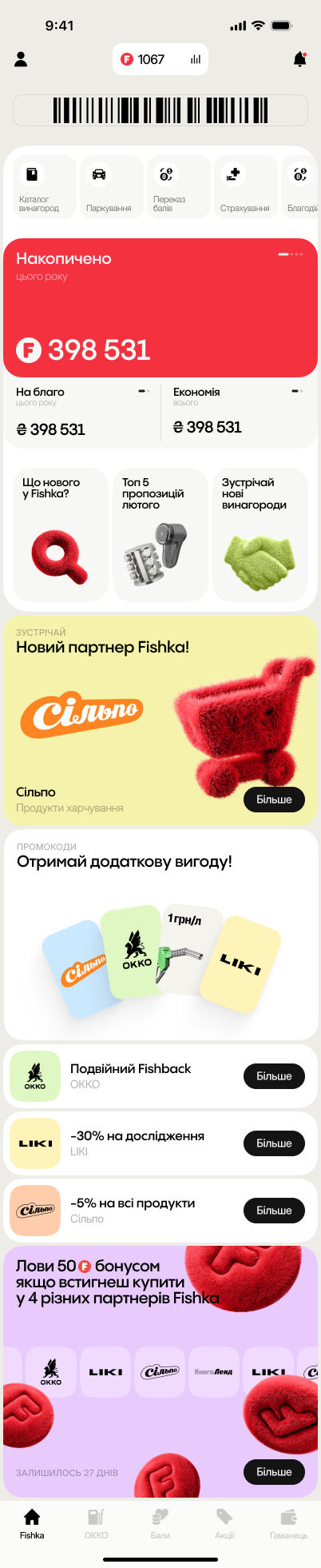
With the structure settled, the new identity was applied to the home experience: 3D objects for content and partner blocks, flat colour fields for offers, and Fishka red reserved for the balance itself.
07 — Reward feedback
Make every reward tangible.
Earning points needed a moment of its own. After a qualifying transaction the app shows the reward as an event — the amount, the new balance and where more points can come from next.
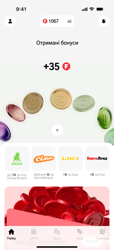
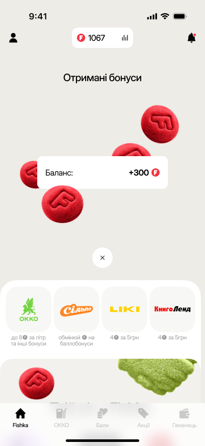
Every transaction closes the feedback loop: earn, see it, know what it is worth.
A loyalty program is only as strong as the moment a user can say what their points are worth.