FEDORIV GROUP · Product design
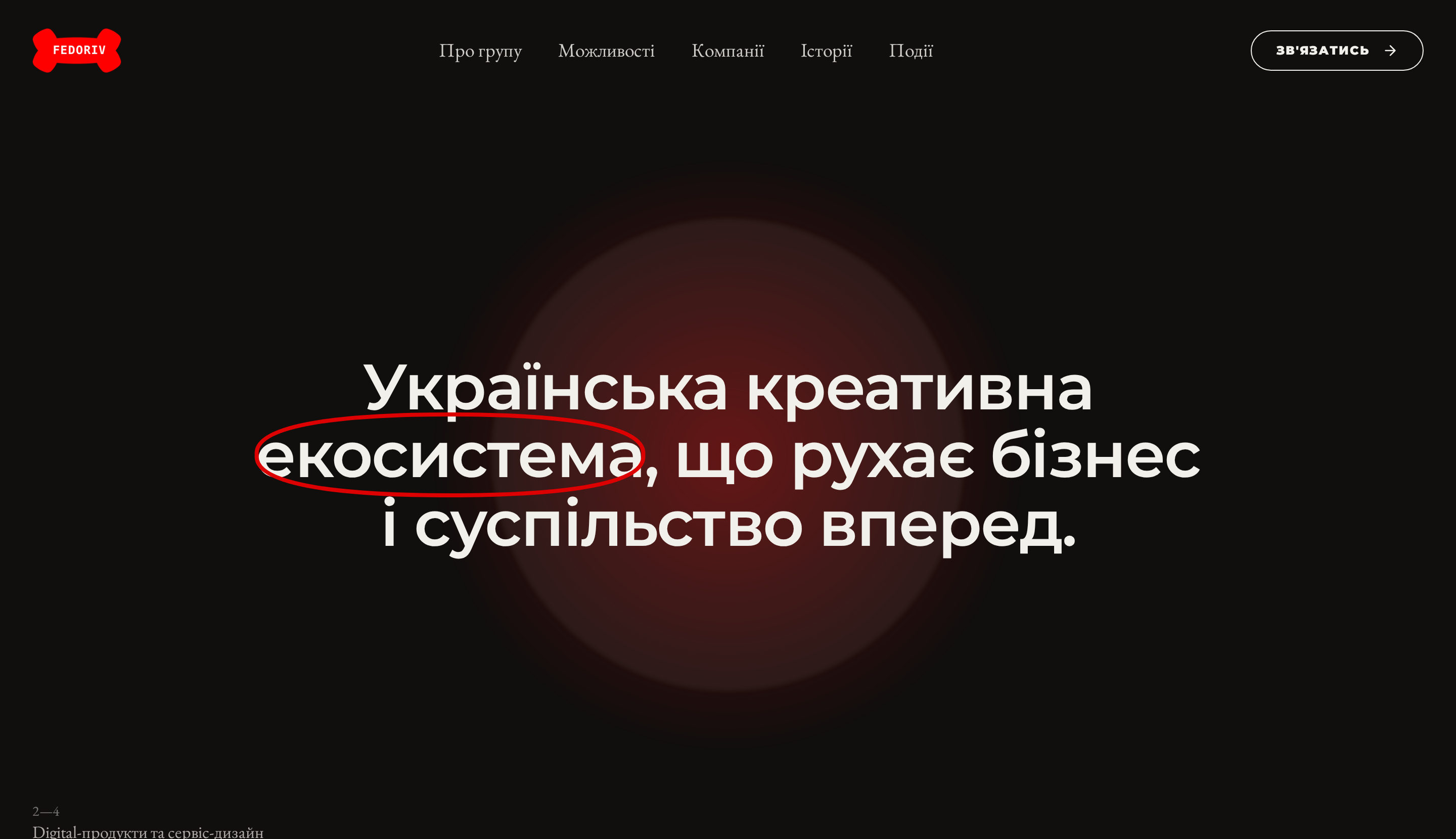
Turning a group of businesses into one navigable ecosystem.
FEDORIV GROUP is seven independent businesses — brand, digital products, capital, real estate, space, education and a social mission. I designed a website where the visitor never has to guess which company to talk to: they start from their own task, and the ecosystem shows the route.
Role
Senior Product Designer
Scope
IA · UX · UI · Motion · Content structure
Platform
Responsive marketing website
Users
Founders · CMOs · Investors · Talent
01 — The context
A creative group that had outgrown its own website.
FEDORIV started as an agency and grew into a group: an agency, a product studio, a venture fund, a real-estate bureau, a co-working and community space, an education and media arm, and a foundation. Each has its own audience and its own sales conversation — but they all shared a single front door.
The group knew what it did. The website made visitors work it out for themselves.
02 — The problem
Four things kept the ecosystem from reading as one system.
SEVEN BUSINESSES, ONE NAME
Agency, digital products, capital, real estate, space, education and a foundation all lived under FEDORIV — but a visitor couldn't tell them apart.
→ People landed, admired the brand and left without a next step.
COMPANY-FIRST NAVIGATION
The old logic asked visitors to already know which company solves their problem.
→ Choosing the entry point became the user's job, not the site's.
PROOF SCATTERED EVERYWHERE
Awards, investments, portfolio news and events existed, but never added up to one credible story.
→ Scale was claimed rather than demonstrated.
STRONG BRAND, WEAK PRODUCT LOGIC
The visual language was bold; the information architecture behind it wasn't.
→ Impressive first screen, unclear second one.
03 — The tasks
What the redesign had to do.
- Start from the visitor's business task — “what do I want?” — instead of the org chart.
- Build one ecosystem map that routes each task to the right company.
- Give every business a consistent module: promise, services, proof, owner.
- Turn numbers, awards and stories into a single evidence layer.
- Keep the editorial, high-contrast brand feel without slowing the page down.
04 — The core idea
“What do I want?” — the site's real navigation.
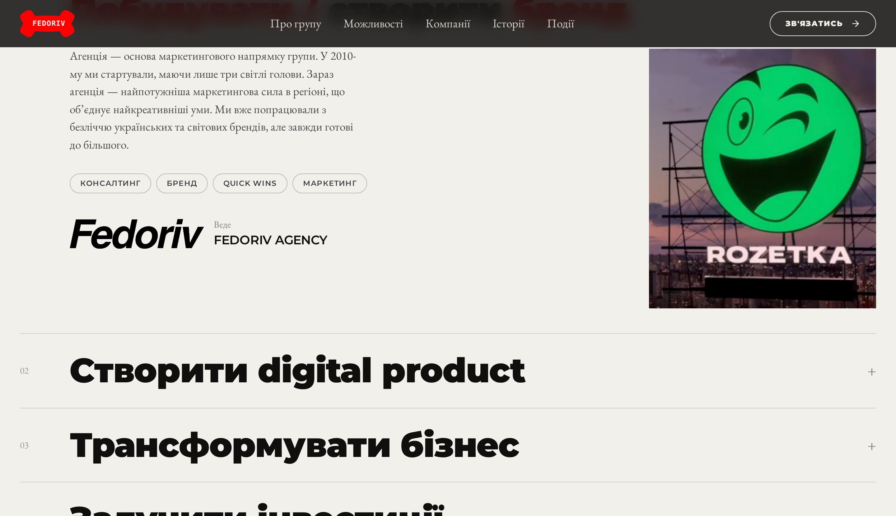
Instead of a company menu, the main section is a list of business intentions. Opening one reveals the promise, the service tags, a proof case and the company that owns it. One interaction turns a group of brands into a routing system.
05 — The companies
Seven businesses, one consistent module.
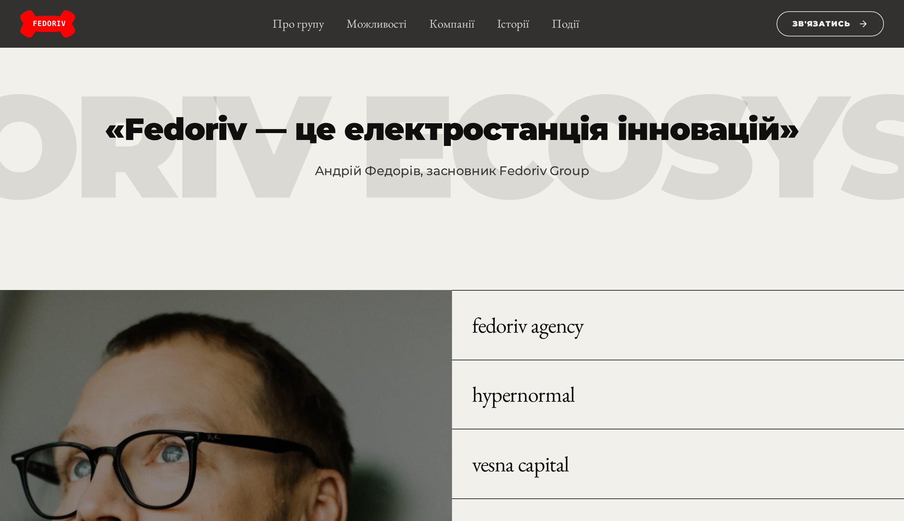
Every company is presented the same way — name, discipline, and the kind of problem it solves — so visitors can compare instead of decode. The shared structure also lets the group add or retire a business without redesigning the page.
06 — The proof layer
Scale shown, not claimed.
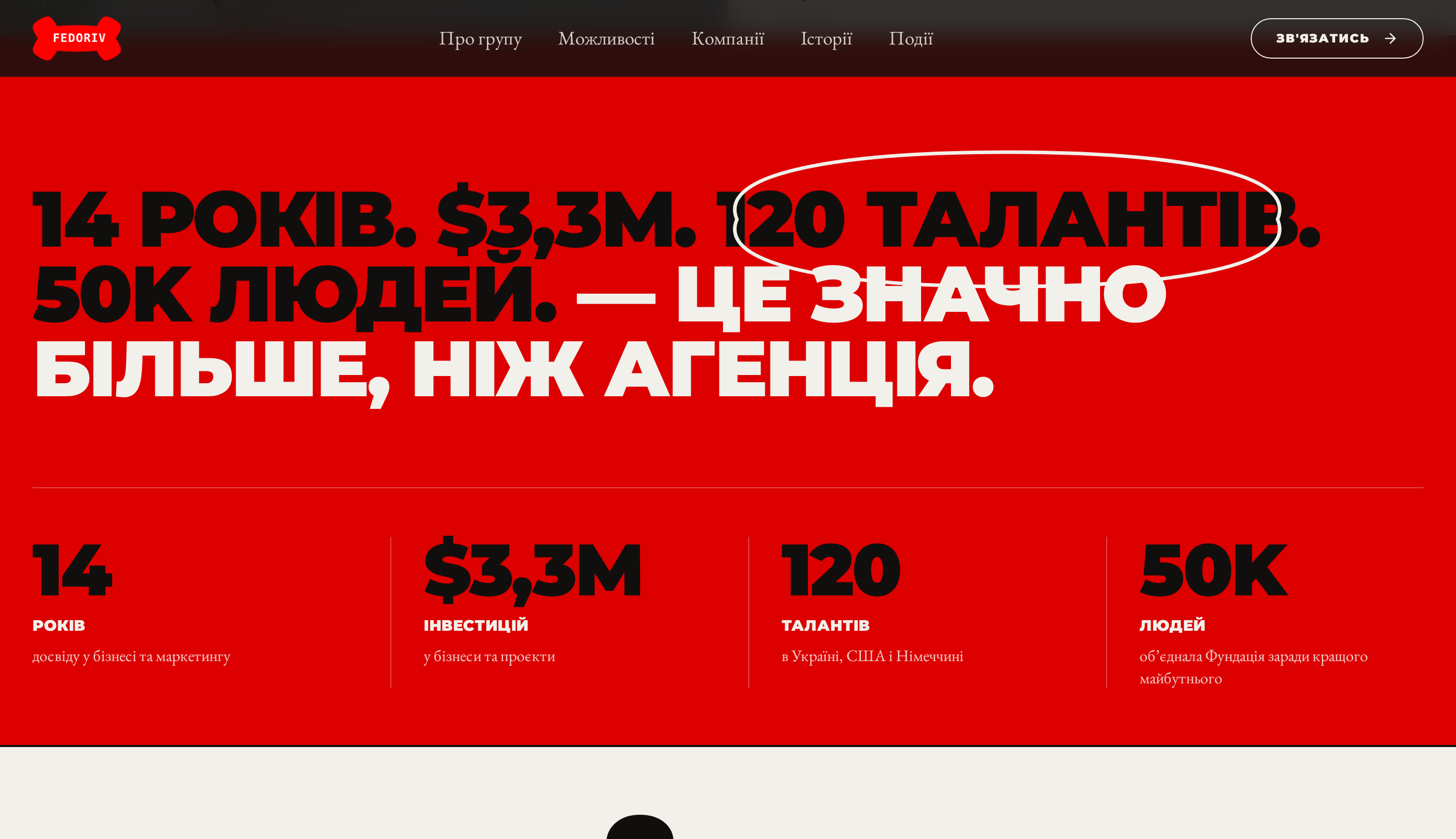
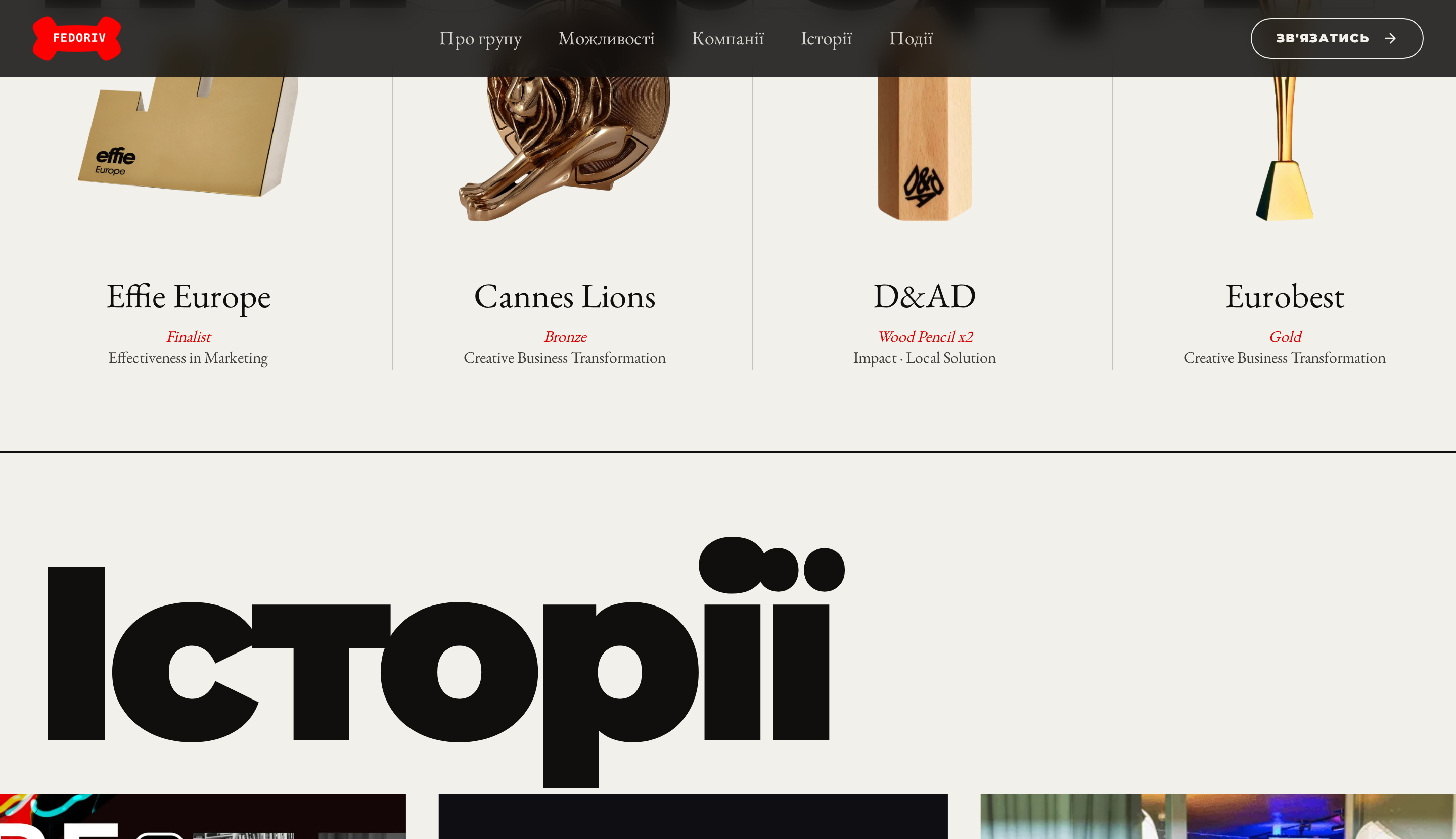
Numbers, awards and portfolio news were pulled into one evidence sequence right after the ecosystem map, so credibility arrives exactly when the visitor is deciding whether to keep reading.
14
years in business and marketing
$3.3M
invested into businesses and projects
120
talents across Ukraine, US and Germany
50K
people united by the foundation
07 — The craft
Editorial brand feel, product-grade structure.
Contrast as hierarchy
A dark, cinematic opening hands over to a light editorial body — the shift itself signals “now we get practical”.
Type doing the work
A serif/grotesque pairing separates narrative voice from system labels without extra UI chrome.
Motion with a job
Scroll and hover states only reveal structure — expanding a route, surfacing a case — never decorate for their own sake.
The hard part wasn't styling a bold brand. It was designing the moment where a visitor's own task picks the company for them.
For visitors
One clear next step.
For the group
Seven businesses read as one.
For sales
Qualified, self-routed leads.
For the brand
Scale that is visible, not stated.